Blue and purple are two colors that often go quite well together in design. But are they truly harmonious colors? To answer that, we need to look at some of the key qualities that make colors harmonious.
Defining color harmony
In color theory, harmony refers to colors that create a pleasant or coherent combination. Harmonious color combinations tend to have certain shared qualities:
- They have complementary hues – colors opposite each other on the color wheel.
- They share similar intensities or values.
- There is contrast between warm and cool tones.
When colors meet these criteria, they tend to look balanced and aesthetically pleasing together. Discordant color combinations, on the other hand, clash and feel visually unsettling.
The characteristics of blue and purple
To determine if blue and purple are harmonious, we need to look at their specific color properties:
Blue
- Hue – Blue is a primary color on the color wheel.
- Value – Blue has a low to medium value depending on the shade.
- Temperature – Blue is considered a cool color.
Purple
- Hue – Purple is a secondary color, made by mixing blue and red.
- Value – Like blue, purple can range from light to dark values.
- Temperature – Purple is generally considered a cool color, though some shades are closer to red and take on a slightly warmer tone.
Looking at their shared color qualities, blue and purple have some strong commonalities that suggest they will be harmonious together.
The color wheel and complementary colors
One of the simplest ways to identify harmonious color combinations is by looking at the color wheel. Colors that are directly opposite each other on the wheel, like blue and orange, are complementary colors.
Complementary colors have a strong visual contrast that creates a vibrant look. This contrast is visually stimulating but also balanced. The opposite hues seem to complement each other in a way that feels unified and aesthetically appealing.
Purple is not directly opposite blue on the color wheel. However, as a secondary color between red and blue, it shares common qualities with both complementary pairs. This gives blue and purple a close complementary relationship.
| Complementary Color Pairs |
|---|
| Blue and Orange |
| Purple and Yellow |
| Red and Green |
Value contrast
Another hallmark of color harmony is contrast between lightness and darkness. Colors with similar hues but different values can create a visually striking look. The contrast adds visual interest and depth.
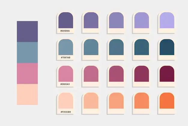
Blue and purple commonly display this type of value contrast. Light purples pop against darker blues, while pale blues shine against deeper purples. This value difference creates contrast while keeping the overall color scheme cohesive.
| Light Color Value | Dark Color Value |
|---|---|
| Light purple | Dark blue |
| Pale blue | Deep purple |
Warm and cool balance
Color temperature is another important factor for harmony. Warm and cool colors balance each other out in pleasing ways. Completely warm or completely cool palettes can feel one-dimensional without this contrast.
Blue and purple provide an inherent mix of warm and cool tones. Blue skews cool while purple tones are often warmer due to their red undertones. Even shades of purple with blue undertones still read as slightly warmer than blue itself. This subtle temperature contrast brings a sense of balance.
| Cool Colors | Warm Colors |
|---|---|
| Blues | Reds |
| Greens | Oranges |
| Purples | Yellows |
Psychology and symbolism
Color psychology also supports the harmonious relationship between blue and purple. While perceptions can vary culturally, some common symbolic associations include:
Blue
- Calming, peaceful, serene
- Intelligence, wisdom, focus
- Professionalism, stability, loyalty
- Tranquility, harmony, unity
Purple
- Royalty, luxury, ambition
- Mystery, spirituality, imagination
- Nostalgia, sentimentality
- Creativity, originality, innovation
The shared qualities and complementary meanings create a very synergistic pairing. For example, the calming properties of blue balance out the energy of purple. And the creative aspects of purple complement blue’s sense of intelligence and stability. This creates a complete palette both visually and psychologically.
Aesthetic appeal
When used together in design and art, blue and purple often produce very aesthetically pleasing results. They blend fluidly into harmonious palettes and gradient blends. Yet they still offer enough contrast to create depth and interest.
Blue and purple work together beautifully across all types of media and genres. Some examples include:
- Landscape art – Blue skies and water with purple mountains and foliage.
- Portraiture – Blue eyes against purple shadowy tones on skin.
- Abstract art – Swirling textures and shapes blending blues and purples.
- Product design – Technology products combining blue accents with deep eggplant cases or buttons.
- Textile patterns – Trails of purple flowers across pale blue backgrounds.
- Interior decor – A bedroom with light blue walls and a vibrant eggplant bedspread.
The colors seem to effortlessly enhance each other in aesthetically soothing ways. This consistent visual appeal supports the inherent harmony between blue and purple.
When blue and purple don’t work
Are there times when blue and purple combinations seem dissonant rather than harmonious? While rare, there are some situations where the colors clash:
- Values are too similar – A very pale blue paired with a very pale purple can get washed out.
- One color dominates – The balance seems off if one color overwhelms the other.
- Too much intensity – Very electric versions of each color side by side may become overpowering.
- Extremely warm purples – When purple skews too red or raspberry it can clash next to cool blues.
Even in these instances, small tweaks to the shades and ratios of the two colors can usually bring the palette back into alignment.
Tips for using blue and purple together
Here are some tips for pairing blues and purples in harmonious ways:
- Aim for contrast – Look for lighter purples against darker blues or vice versa to create visual interest.
- Include neutrals – Add creams, whites or grays for a softer look that lets the colors pop.
- Use blue as an accent – Since purple has higher energy, blue accents can create needed balance.
- Add texture – Layer shimmery blues over matte purples or combine metallic and flat versions.
- Watch warmth – If the purple skews very warm, opt for cooler blue tones.
- Consider context – A vibrant editorial design can handle bolder hues than a minimalist branding palette.
Conclusion
When factoring in their color theory relationships, symbolic meanings, and real-world aesthetic appeal, blue and purple prove to be very harmonious pairing. They share enough key traits to complement each other beautifully, both visually and psychologically. There are certainly successful ways to combine the two colors that live up to their harmonious potential.
Of course, context and execution still play a role. But overall blue and purple have strong inherent harmony. Their ability to blend into cohesive palettes across all types of applications confirms their synergistic relationship. So while not precisely complementary colors, blue and purple can confidently be considered harmonious counterparts.
