Colour is a powerful storytelling tool in cinematography. The colours that are chosen for a film’s costumes, production design, and lighting schemes have a significant influence on the overall tone, mood, and meaning of the visuals. Colours can be used in films to establish time periods, locations, character personalities and relationships, as well as themes and motifs. The artful manipulation of colour is part of what distinguishes the work of great cinematographers.
The Basics of Colour Theory
Before diving into the specifics of how colour is utilized in cinematography, it is helpful to understand some basic principles of colour theory.
The primary colours are red, yellow and blue. Mixing two primary colours creates secondary colours – green, purple and orange. Tertiary colours are created by mixing a primary and secondary colour, such as red-orange or blue-green.
Complementary colours are those opposite each other on the colour wheel, such as red and green or blue and orange. Complementary colour pairs form strong visual contrasts.
Analogous colours sit next to each other on the colour wheel, such as blue, blue-violet and red-violet. Analogous palettes create harmonious combinations.
Warm colours like red, orange and yellow evoke feelings of energy and warmth. Cool colours like blue, green and violet feel more soothing and calm.
Value refers to how light or dark a colour is. Tones are created by adding black or white to a hue to alter its value.
Saturation or intensity refers to how vibrant or muted a colour is. A highly saturated colour appears intense, while a dull, greyed colour has low saturation.
These basic principles come into play in significant ways when constructing the colour palettes of films.
Setting a Time Period
One of the most straightforward uses of colour in cinema is to establish a specific time period or decade. The colours prominent in design and fashion during different eras can provide quick visual cues to orient the audience temporally.
For example, the lush Technicolor palette of 1930s Hollywood films instantly transports viewers to that era. The bold primary colors and early color processes created a visual style particular to that time. Period films recreating the 1930s and 1940s will frequently utilize similar Technicolor looks.
The saturated neon colours and pastels of 1980s aesthetics have also become visual shorthand for films set in that decade. Using the bright, funky colour schemes prevalent in the 80s helps plant audiences in that specific cultural moment.
Conversely, films striving for a contemporary look will utilize the muted, earthy colour palettes popular today. Desaturated, slightly retro colouring helps modern films feel grounded in the current age.
So linking the colour design of a film to prominent hues from various eras is an efficient way to quickly signify the time period.
Establishing Setting
Colour choices can also indicate the geographic location or general setting of the story. Use of warm, sandy tones brings to mind harsh desert climates, while cool blues and grays evoke the bleakness of the arctic or other cold regions.
Lush greens and deep shadows could establish a jungle setting. For urban environments, grading choices like cyan-dominant night scenes suggest a modern metropolis.
In essence, selecting colours that the audience associates with certain real-world locales helps transport them there fictionally. A few broad visual strokes with colour go a long way in fleshing out the film’s world.
Creating Mood
Cinematographers pay close attention to colour palettes when establishing the overall mood of their films. Warm, pleasantly saturated hues tend to visually communicate joy, levity, or comfort. Comedic films often utilize high contrast, vibrant colour schemes to reinforce a light-hearted mood.
Meanwhile, darker, muted colour palettes dominated by blues, grays and greens promote more somber, tense, or melancholic moods. Thrillers and horror films frequently rely on colder colours to viscerally unsettle audiences.
Some films use colour contrasts to heighten the mood. A protagonist’s joyful memories may be shown using warm, bright colours, then switch to gloomy, desaturated hues when trauma occurs. The contrast visually mimics the emotional tone.
So manipulating colours provides cinematographers an effective tool for controlling the psychological experience of audiences, guiding them to particular interpretations and reactions.
Symbolism
Directors working with their cinematographers also utilize colour symbolically, to reinforce symbolic meanings or allusions in the narrative.
For example, the colour red holds multiple associations – love and passion, but also danger, blood, violence, or moral corruption. A character clothed in red could subtly indicate their arc involving those concepts. Green often symbolizes new growth, prosperity or change.
Blue generally symbolizes calmness, spiritual themes, or contemplation. White conveys purity and innocence, while black can imply mystery, death, or menace, when used dramatically. Purple may denote royalty or luxury.
So colours allow complex story concepts to come through visually, in shorthand symbolic ways. Audiences inherently associate certain meanings with particular colours, making it a useful cinematic shorthand.
Characterization
The choice of colour palettes is often deliberately tailored to reinforce character development and relationships. Costume, production design, and lighting schemes establish the personalities and dynamics between characters through deliberate colour motifs.
For example, a couple deeply in love may constantly wear complimentary colours in their costumes, visually conveying their compatibility. But if the relationship turns toxic, one lover might shift to only clashing, off-putting colours, subliminally indicating the tensions.
A character’s environment could grow cold and pale as they descend into depression. Or they might be lit with increasingly sinister lighting as their dark side comes out. Heroes and villains are often differentiated through colour-coded appearances and worlds, with the good guys more brightly lit.
So cinematographers know how to script colours around characters, to subtly accentuate the desired viewer interpretations about who they are inside and how they relate to others. It is another useful cinematic tool.
Meaningful Colour Contrasts
Beyond colour choices for individual elements, cinematographers craft powerful contrasts between elements through colour.
Juxtaposing complementary or clashing colours creates visual energy and tension. This technique can heighten a dramatic moment, or underline a thematic conflict.
Placing a pale figure against a dark, saturated background ensures they draw viewer focus. Similarly, intense colours will pop against neutral, muted backgrounds.
Suddenly changing between a warm, bright scene to a cold, dark one helps mark a tonal shift. Fading from colour into black-and-white could indicate a character’s reminiscence or memory. Shifting from a limited to expanded colour palette could show the world opening up to a character with new awareness.
These types of motivated colour contrasts move the storytelling along by mirroring narrative or emotional dynamics. It amplifies the film’s intended design.
| Colour | Typical Connotations |
|---|---|
| Red | Love, passion, danger, blood, violence, corruption |
| Green | Growth, prosperity, renewal, change |
| Blue | Calmness, spirituality, contemplation |
| White | Purity, innocence |
| Black | Mystery, death, menace |
| Purple | Royalty, luxury |
Practical Lighting Considerations
Beyond storytelling uses, the choice of colours in cinematography is also influenced by practical lighting limitations. Certain colours reproduce better than others with different film stocks and digital sensors. Brightness, film speed, and lighting challenges also affect colour possibilities.
Vibrant reds and oranges tend to distractingly ‘bloom’ with film. Blues and greens read much cleaner, with muddier or muted reds. So cinematographers often gravitate towards teal/orange colour schemes. Skin tones reproduce well in that range too.
The colour contrast of elements in frame also affects their visibility. If colours are too similar in value, shapes and contours get lost. So cinematographers keep background colours distinct from skin tones and key elements, to maintain clarity in shaping the visual narrative.
Available lighting sources also determine colour options. Candlelight offers warmer tones, fluorescents lean green/blue. Incandescent bulbs can be filtered for selective colours. Coloured gels on practical lights or rigged over windows strongly influence the palette.
So cinematographers factor in these technical and logistical limitations regarding colour, while crafting their visual storytelling.
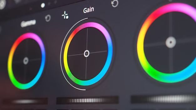
Post-Production Grading
The final stage of colour manipulation happens in digital intermediate grading for film, or colour correction for video. Even with meticulous production design and lighting, the desired palette is fine-tuned here.
Grading adjusts hue, saturation, brightness, contrast and balance across the frame and shots. Cooler or warmer tones are added to calibrate the mood. For continuity, skins tones and colours are matched between shots. Creative stylization also occurs, like adding monochromatic sequences.
Through Digital Intermediate processes, extensive colour changes and enhancements can be made that were impossible with traditional film colour timing. This allows greater creativity, as well as correcting issues with original filming.
So the colour palette and schemes designed during production provide a starting point, to be further elevated and polished through grading in post, the final word on the visual presentation.
Conclusion
Colour is a vitally important cinematic tool. Many films have defined their greatness through ingenious uses of colour to tell the story and affect audiences visually and emotionally.
Cinematographers devote much care and intention to sculpting colour schemes around characters, settings, themes and moods. Their colour choices stylistically enhance narratives and deepen meanings. Even Practical lighting issues factor into colour plans.
The colours prominently used in beloved films often become their defining visual trademarks. Audiences intrinsically associate those palettes with treasured cinematic memories and experiences.
So colour utilization is a foundational aspect of cinematic language that speaks directly to the psychology of viewers. Master filmmakers recognize this and leverage colour to imprint their films visually in the minds and hearts of audiences. That is the potent spell which cinematography’s colour mastery can cast upon the screen.
