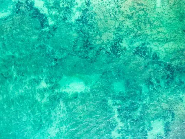
Aqua and turquoise are two colors that are quite similar and often confused with one another. Both are bluish-green tones that evoke a sense of cool, calming water. However, there are some key differences between aqua and turquoise that help distinguish them. In this article, we’ll examine the definitions, origins, color codes, and uses of aqua and turquoise to understand how they are similar and different.
Defining Aqua
Aqua is a light bluish-green color that got its name from the Latin word for water. It is the color between green and blue on the color wheel. Aqua has high amounts of green and blue but very little red.
Some key facts about the color aqua:
| Hex Code | #00FFFF |
| RGB Code | R: 0 G: 255 B: 255 |
| CMYK Code | C: 100 M: 0 Y: 0 K: 0 |
| Hue | Cyan |
| Saturation | 100% |
| Brightness | 100% |
The hex code #00FFFF shows that aqua has full values of green and blue but no red. The RGB code indicates the same thing. Aqua’s cyan hue sits between green and blue on the color wheel. With full saturation and brightness, aqua is a very vibrant, luminous color.
Defining Turquoise
Like aqua, turquoise is a mix of blue and green but it has some key differences. Turquoise contains a bit more blue and less brightness than aqua.
Some key facts about the color turquoise:
| Hex Code | #40E0D0 |
| RGB Code | R: 64 G: 224 B:208 |
| CMYK Code | C: 100 M: 0 Y: 20 K: 12 |
| Hue | Cyan |
| Saturation | 72% |
| Brightness | 88% |
The hex code #40E0D0 shows turquoise has more blue than aqua, with higher values for blue and green but a lower red value. The cyan hue is the same but turquoise has lower saturation and brightness than aqua. This makes it slightly darker and less vibrant.
Origins of the Colors
The origins of the aqua and turquoise names also provide some insights into their differences.
Aqua
As mentioned, aqua comes from the Latin word for water. Its name evokes the pale, cool colors of water. The term aqua began to be used for the color in the 1920s.
Turquoise
Turquoise got its name from the precious stone of the same color. The stone was first imported from Turkey in Europe during the 17th century. The French called it “pierre tourques” meaning “Turkish stone” which later became the word turquoise. The gemstone color is thought to be slightly darker and greener than the typical turquoise pigment color used today.
So while aqua relates to the color of water, turquoise originated from a greenish-blue gemstone. This helps explain why turquoise tends to be darker and greener than aqua.
Color Codes
The hex, RGB, CMYK, and HSB color codes for aqua and turquoise also demonstrate their subtle differences.
Some key observations:
– Aqua has full saturation while turquoise has only 72% saturation, making aqua more vivid.
– Turquoise has higher blue values than aqua in both RGB and CMYK codes.
– Turquoise is slightly darker with 88% brightness vs 100% for aqua.
– Both share a cyan hue but turquoise skews slightly greener.
So while the color codes show overlap between aqua and turquoise, aqua leans more towards pure blue-green while turquoise has more blue with some green and lower brightness.
Comparison of Aqua vs. Turquoise
Here is a direct comparison of some key attributes of aqua vs. turquoise:
| Attribute | Aqua | Turquoise |
|---|---|---|
| Hex Code | #00FFFF | #40E0D0 |
| RGB Code | R: 0 G: 255 B: 255 | R: 64 G: 224 B: 208 |
| Hue | Cyan | Cyan |
| Saturation | 100% | 72% |
| Brightness | 100% | 88% |
This makes it clear that aqua is a brighter, more saturated cyan while turquoise is slightly darker and less saturated with more blue tones.
Use Cases
When are aqua and turquoise colors used? Here are some common applications:
Aqua
– Associated with water, used for water company logos
– Energizing accent color
– Highlights on graphs/charts
– Athletic team colors (e.g. Miami Dolphins)
Turquoise
– Beads, jewelry, and decor with a Southwestern or Native American motif
– Accent walls and furniture upholstery
– Vintage product designs from the 1950s-1970s
– Spa and wellness branding
So aqua pops more as an energizing accent color, while turquoise has an earthier, retro vibe. But both evoke watery, relaxing feelings.
Which is Darker?
With its lower brightness level of 88% (compared to 100% for aqua), turquoise is slightly darker than aqua. The higher blue content also makes turquoise appear darker. However, the difference is subtle. Turquoise is moderately dark, while aqua is very light.
Which is Greener?
While both colors have a cyan hue, turquoise contains more green than aqua. Its origins from the greenish-blue turquoise gemstone contribute to turquoise having slightly more green undertones than pure aqua. However, neither color is very green compared to emerald hues. Turquoise simply has a subtle greenish tinge.
Which is Brighter?
Aqua is much brighter than turquoise. Its 100% brightness level makes aqua seem luminous, glowing, and high energy. Turquoise appears more muted at 88% brightness. Aqua will stand out more and “pop” against other colors. Turquoise is best for more low-key accent use rather than a vivid focal point.
Are They Interchangeable?
Aqua and turquoise have enough overlap that they can substitute for one another as accent colors in some cases. However, there are certain contexts where one color is more suitable than the other:
– Aqua better suits an energetic, youthful beachy look.
– Turquoise aligns better with Southwestern decor for an earthy aesthetic.
– Vintage mid-century products lean toward turquoise as an accent.
– Aqua pops more on graphs and infographics with its brightness.
– Turquoise works for spa/wellness branding that is meant to be calming.
So while interchangeable in some situations, the two colors create somewhat different moods based on their contexts.
Conclusion
In summary, aqua and turquoise are similar bluish-green colors but aqua is brighter and more saturated while turquoise is slightly darker with more blue and green content. Aqua evokes pure water while turquoise relates more to its earthy gemstone origins. While they can sometimes substitute for one another as accent colors, aqua and turquoise each fit certain aesthetics better based on the desired mood and emotions. Knowing their unique attributes helps design professionals choose the more suitable shade for their specific needs.
