Purple is a color that evokes mystery, creativity, and imagination. It occupies an intriguing space between warm and cool tones on the color wheel. Purple combines the passion and energy of red with the calm stability of blue. This blending gives purple shades unique temperature characteristics depending on how much red or blue they contain. So is there such a thing as a warm purple? The answer is not quite as straightforward as you may think.
The Color Wheel
To understand whether warm purples exist, we first need to look at how color temperature works. The color wheel arranges colors by hue in a circle format. Reds, oranges, and yellows are considered warm colors. Greens, blues, and purples are considered cool colors. Warm colors feel energetic and vivid. Cool colors feel serene and soothing.
Colors that contain more red, orange, or yellow appear warmer. Colors with more blue or purple seem cooler. On the standard 12-part color wheel, purple sits between red and blue. So in theory, purple can take on warm or cool properties depending on whether it shifts closer to red or blue.
Color Temperature
Color temperature measures how warm or cool a color appears. It is measured on a scale from 1,000 to 10,000 Kelvin. Lower Kelvin temperatures are warm colors, while higher temperatures are cool colors. Here are some key reference points on the Kelvin scale:
| Kelvin Temperature | Color Appearance |
|---|---|
| 1000-2000K | Candlelight, sunset colors |
| 2500-3500K | Tungsten bulbs, warm white |
| 4000K | Neutral white |
| 5000K | Cool fluorescent, daylight |
| 6000-7000K | Overcast sky, LCD displays |
| 8000-9000K | Shade and overcast sky |
Most purples fall in the 5000-8000K range, giving them a relatively cool appearance. But shades closer to 4000K will read as warmer purples.
Warm and Cool Purples
Within the purple family, hue, brightness, and saturation affect temperature. Here are some guidelines for warm and cool purples:
– Purples with more red or pink come across as warmer (e.g. magenta).
– Purples with more blue seem cooler (e.g. violet).
– Darker, muted purples appear cooler.
– Brighter, lighter purples look warmer.
– Grayish purples are cooler. Pure purples are warmer.
– Duller, less saturated purples are cooler. Vivid purples are warmer.
So in summary, warm purples contain enough red and vibrancy to overcome the coolness of blue and purple. They are lighter, brighter, and more vivid than many traditional purple shades.
Examples of Warm Purples
Here are some examples of purples that lean warm due to their underlying red tones:
– Mulberry – A red-toned purple, almost a purple-brown.
– Mauve – Contains gray but in lighter tones comes across as soft and warm.
– Plum – A rich, vivid reddish purple reminiscent of plum skin.
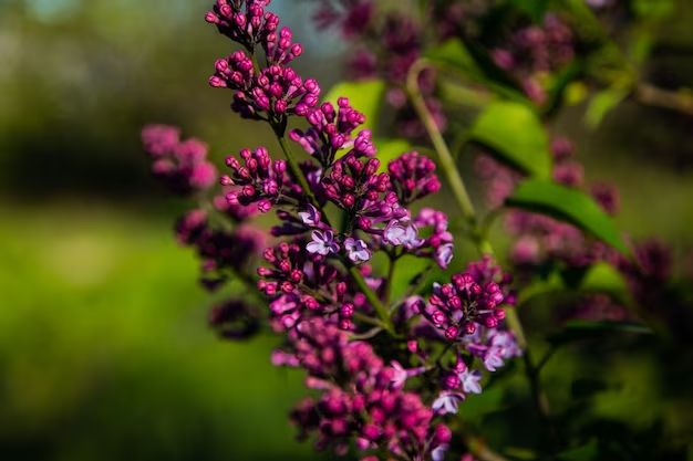
– Lilac – Has a pinkish undertone that gives it warmth.
– Lavender – Only warm when lightened and made more vibrant.
– Wisteria – A lighter, brighter purple with definite warm undertones.
These warmer purples work well in soft, feminine color palettes. They provide energy while still keeping an air of romance about them.
Examples of Cool Purples
Here are some classic cool-toned purples:
– Violet – Hint of blue makes this shade crisp and cool.
– Eggplant – A darker, grayish purple that feels cool.
– Grape – Muted and more subtle than vibrant purples.
– Amethyst – Grayish purple, cooler at darker values.
– Byzantium – Reddish-purple but still on the cool end of the spectrum.
– Orchid – Despite pink tones, the blue in orchid keeps it cool.
Cooler purples work beautifully for sophisticated, creative color schemes. They have an air of mystery and intrigue.
Warm or Cool Context
The surroundings and context also influence whether a purple appears warm or cool. A vibrant purple may seem cool alongside warm reds and oranges. But the same purple will read as warm next to blues and greens. Subjective perception means purple’s temperature can shift.
Purple in Design
In design, warm and cool purples each serve unique purposes. Warm purples create energy and excitement. They grab attention while still projecting femininity. Cool purples are excellent for subtle, tasteful elegance. They can recede into the background or add depth as an accent.
In print design and branding, purples work for backgrounds, graphics, and text. They represent imagination, creativity, and wisdom. In web design, light warm purples make great header colors. Vivid purples complement green call-to-action buttons.
In interior design, warm purples are energizing as feature walls or as accents. Cool purples lend restful sophistication in a subtle way. Pair purple with metallics and grays for sleek modern spaces.
Conclusion
While purple sits firmly on the cool end of the color spectrum, adding the right amounts of red and pink does allow warmer shades to emerge. These warm purples retain the intrigue of purple while dialing up the energy and brightness. They provide a lively alternative to traditional cool purples.
So in the world of color, warm purples do indeed exist. With the versatility of purple, these shades fill a unique niche. Warm purples are vibrant, emotive and endlessly adaptable. They allow the excitement of red and orange to mingle poetically with the imagination of blue and purple. For designers, warm purples offer exciting new possibilities. So embrace the mystery and intrigue of purple’s dual temperature nature.
