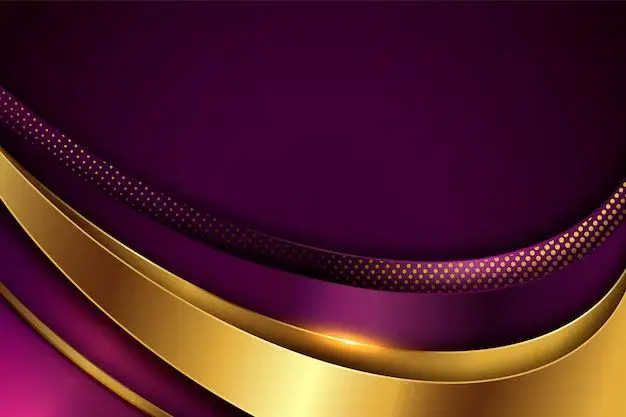
Purple and gold are rich, luxurious colors that complement each other beautifully. When paired together in fashion, interior design, or graphic design, these two shades create an eye-catching and elegant color combination. But purple and gold can sometimes appear overly bold or bright on their own. Adding a third, softer neutral or pastel color helps balance the look and allows the purple and gold tones to really shine. So what is the best color that compliments purple and gold? Let’s take a look at some of the top options.
Soothing Silver
One of the most popular and versatile colors that pairs effortlessly with purple and gold is silver. The cool, metallic tones of silver help balance out the warm, rich shades of purple and gold. Silver creates a glamorous and sophisticated look when combined with these jewel-inspired colors.
In fashion, adding silver shoes, jewelry, clutches or other metallic accents to a purple and gold outfit adds a contemporary edge. Silver works equally well for both formal and casual ensembles featuring these colors. In interior design, silver furnishings like lamps, mirrors and decor pieces give a luxe hotel feel when mixed with purple and gold accents.
Silver is also a natural complement in graphic design. It helps purple and gold pop when used in logos, presentations, websites, flyers and more. On color wheels, silver sits between the two complementary colors of purple and gold, helping bridge them visually. Overall, silver is one of the most versatile and easy-to-pair neutrals with purple and gold palettes.
Pretty Pearl Tones
Another soft, neutral shade that expertly complements purple and gold is pearl. Sometimes called champagne, these creamy off-whites add a romantic and feminine touch to purple and gold color combinations. Pearl tones are inspired by nature – think shimmery interior linings of seashells or white sand beaches.
In fashion, pearl shoes, bags, lace and other accents soften bold purple and gold outfits – perfect for weddings, date nights, bridal showers and formal events. Pearl tones also pair well in interior design, lightening up and brightening rich purple and gold furniture, wall colors, carpets and decor. Pearl hues add refinement to graphic design as well, providing a delicate background that makes purple and gold details stand out.
Overall, pearl tones are ideal for creating a soft, dreamy aesthetic when paired with jewel-toned purple and gold. Pearl accents keep these colors from feeling too flashy or overpowering.
Earthy Greens
For a more casual, nature-inspired look, earthy greens beautifully complement purple and gold. Think mossy, sage, olive and forest shades that feel organic and grounding. These greens help give purple and gold palettes a bohemian or rustic vibe.
In fashion, pine green jackets, emerald peasant tops and olive pants or skirts balance out jewel-toned purple and gold outfits. Throw in some gold jewelry and purple accessories for a harmonious look. In interior design, deep green furniture, rugs, throw pillows and wall colors enrich gold fixtures and purple decor pieces. And for graphic design, an emerald green backdrop helps gold logos and purple headers stand out elegantly.
Earthy greens are a smart choice for toning down the decadence of purple and gold. The colors feel natural together, evoking images of regal amethysts and shimmering citrine crystals growing amongst moss in nature. Overall, earthy green is a foolproof color for adding an organic twist to purple and gold color schemes.
Crisp White
For traditional and timeless purple and gold combinations, classic white is the perfect neutral. White lightens and brightens these darker tones, creating sophisticated color schemes. White also represents purity and innocence – a striking contrast to purple and gold’s lavishness.
In fashion, white tops, dresses, pants and accessories artfully balance the drama of purple and gold jewelry, bags, shoes and outerwear. For interior design, white sofas, chairs, rugs and walls provide blank canvases where purple and gold accents can shine. White backgrounds are ideal in graphic design as well, ensuring purple and gold details stand out crisply.
Overall, white is a versatile neutral that complements purple and gold across all genres. It dilutes the potential loudness of the two colors, while enhancing their beauty. For traditional and minimalist aesthetics, white is the perfect third color for purple and gold palettes.
Muted Grays
For a more modern, urbane look, muted grays beautifully complement purple and gold. Cool medium grays, sleek charcoal tones and sophisticated silver grays help ground purple and gold’s punchy hues. These muddied grays have blue undertones, which pair harmoniously with purple’s blue base.
In fashion, gray jackets, pants, shoes and bags tone down purple and gold jewelry or prints. In interior design, gray walls, sectionals, carpets and decorative pieces provide an edgy, contemporary backdrop for purple and gold accents. And in graphic design, gray backgrounds allow purple and gold graphics to stand out with vibrancy.
Overall, muted grays create minimalist, refined aesthetics alongside purple and gold. Grayscale palettes keep the accent colors from competing too much. Yet grays don’t overpower the beauty of purple and gold either. It’s an elegant, modern color combination.
Vibrant Turquoise
For boho, eclectic and artsy looks, vibrant turquoise beautifully complements purple and gold palettes. The mix of cool blues and vivacious greens in turquoise play off the mix of cool blues and warm yellows in purple and gold. This creates color harmony.
In fashion, turquoise jewelry, handbags, shoes and other accessories give purple and gold outfits a playful punch. Turquoise home decor mixed with purple and gold furnishings creates a retro, psychedelic ’70s vibe. And for graphic design, turquoise overlays, backgrounds or details pop against purple and gold logos, icons and headers.
Overall, the aqua tones of turquoise shake up purple and gold color schemes in fun, creative ways. Turquoise prevents these palettes from feeling stuffy or predictable. Instead, it livens up purple and gold with a festive, artistic flair.
Soft Blush Pinks
For a decidedly feminine look, blush pinks pair seamlessly with purple and gold. Dusky mauves, powdery cotton candies and peachy pinks balance the bold decadence of this color combination with ethereal softness. Blush pinks also bridge the gap between purple’s cool tones and gold’s warm ones.
In fashion, pastel pink dresses, sweaters, bags and shoes feminize and soften purple and gold jewelry or embellishments. In interior design, pink accents like curtains, pillows and ottomans give warmth to purple and gold furniture and decor. And in graphic design, pink backgrounds lend a romantic, dreamy feel for purple and gold details to shine against.
Overall, blush pinks dial down the intensity of purple and gold in graceful ways. The resulting looks are delicate, vintage and feminine. For romance, charm and whimsy, blush pink completes purple and gold palettes beautifully.
Bold Blue
Vivid blues – like cobalt, royal blue and electric blue – also pair strikingly with purple and gold. These energizing shades have a dynamic effect alongside purple and gold, creating high-impact color combinations.
In fashion, royal blue dresses or blazers make purple handbags and gold shoes really pop. In interior design, navy blue accent walls highlight purple furniture and gold decorative pieces in bold ways. And bright blue backgrounds in graphic design ensure purple and gold graphics stand out with vibrancy.
Overall, vivid blues amp up the energy of purple and gold palettes for powerful visual effects. They enhance the richness of purple and gold through contrast, without overwhelming them. Think of vivid blues as the exclamation point when paired with purple and gold schemes.
Deep Red
For opulent, luxurious aesthetics, few colors complement purple and gold as flawlessly as deep red. Crimson, oxblood, burgundy and wine reds all regally enhance these cool and warm jewel tones when combined.
In fashion, red dresses, coats, shoes and purses feel decadently lavish next to purple and gold jewelry or accessories. In interior design, red lounge chairs, throw pillows and rugs intensify nearby purple and gold furnishings and decor. And in graphic design, deep red adeptly highlights purple and gold graphics and details.
Together, red, purple and gold create harmonious triadic color schemes on the color wheel. Paired in design, these rich shades convey royalty, luxury and indulgence for dramatic visual impact. Deep red completes purple and gold palettes in sumptuous style.
Conclusion
Purple and gold make a bold color pairing full of spirit and personality. But adding a neutral or tonal third color helps soften and balance this dynamic duo for more versatile aesthetics. Silvers, pearls, earthy greens, crisp whites, muted grays, turquoise, blush pinks, vivid blues and deep reds all perfectly complement purple and gold in elegant ways.
With endless options, you can tailor the third color to your specific style and vision. So whether you seek traditional, edgy, feminine or nature-inspired looks, consider these expertly curated color combinations next time you rock purple and gold. The visual results will feel complete and totally harmonious.
