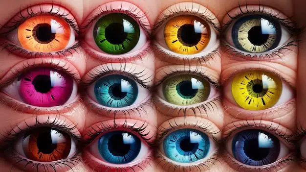
When it comes to picking colors that are gentle on the eyes, the choices may seem endless. However, research has shown that certain shades cause less eye strain than others. In this article, we’ll explore the science behind eye-friendly colors and help you choose paint colors, computer screens, reading lights, and more with your vision health in mind.
How Light Affects Our Eyes
Visible light is part of the electromagnetic spectrum that our eyes can detect. Light wavelengths are measured in nanometers (nm) and range from about 380-750 nm. The different wavelengths we perceive as different colors.
Our eyes are complex organs with specialized cells that convert light into electrical signals to the brain. The retina contains photoreceptor cells called rods and cones. The rods detect light and dark, while the cones detect color. We have three types of cones that are sensitive to short (blue), medium (green), and long (red) wavelength light.
Exposure to light causes chemical reactions in the retina, which can generate oxidative stress. Over time, excessive exposure to blue and violet light is believed to cause damage that contributes to eye conditions like age-related macular degeneration.
Low Light Levels Reduce Eye Strain
Bright light overwhelms the eyes’ photoreceptors and leads to eye fatigue and strain. Studies show that eye strain increases when computer users look at brighter screens for prolonged periods.
Working in low lighting allows the pupils to dilate more widely and reduces effort to see. This puts less burden on the eyes’ focusing muscles and photoreceptors. Proper lighting also minimizes glare that can reflect off shiny surfaces.
Longer Wavelength Colors Are More Soothing
Shorter, high-energy wavelengths like blue and violet can damage eye tissues over time. Longer, low-energy wavelengths like orange, yellow, and red are gentler on the eyes.
Warm colors with red and yellow tones have longer light wavelengths near the red end of the visible spectrum. Studies show people rate warm-colored rooms and lighting as more pleasant and comfortable than cool-colored lighting.
Avoid High Contrast Between Colors
Using colors of similar brightness reduces eye strain. High contrast between dark and light colors forces the eyes to constantly readjust.
For example, bright white text on a black background has high contrast and is difficult to read comfortably. Off-white or beige text on a gray background provides lower contrast and is easier on the eyes.
The Best Background Color for Eyes
The most eye-friendly background color is a soft warm gray. Gray reduces glare while providing enough contrast between text and background to keep the eyes comfortable.
Blue backgrounds may seem soothing, but blue light can be damaging over time. Green backgrounds are also not ideal for extended reading.
A beige or gray background is the best choice for computer displays, e-readers, and other screens you look at for prolonged periods. For paper, an off-white or cream color is gentler on the eyes than bright white.
The Most Soothing Text Color
Black text on a white background provides the sharpest contrast and best legibility. But high contrast strains the eyes over time. Dark gray, brown, or dark blue text is gentler for extended reading.
Light text on a dark background, known as reverse contrast, also reduces eye strain. Green, amber, or white text on a black or dark gray background can be comfortable for people with normal vision.
Avoid red text, which is hardest for the eyes to focus on. Red wavelengths focus in front of the retina instead of directly on it, making the eyes work extra to see sharp red text.
Best Colors for Reading Lights
Cool white light sources with blue wavelengths are harsh for extended reading. Warm white LED or incandescent lights are much less straining on the eyes.
Amber is an especially eye-friendly color for reading lamps. Amber light bulbs filter out blue wavelengths and have an orange-yellow glow that provides enough illumination for reading while minimizing glare.
Paint Colors for Optimal Eye Comfort
The best paint colors for eye comfort in rooms with extended exposure to reading or screen use are in the warm, muted color palette. Soft tones of tan, peach, buttercream, or wheat minimize glare and absorb bright light.
Cool grays and greens are suitable as accent colors in small amounts. Use them in moderation on accent walls or furnishings to avoid eyestrain from excessive exposure.
Best Eyeglass Frame Colors
Eyeglass frames in colors like tortoiseshell brown, taupe, silver, or gray blend in peripherally for the eyes better than white frames or brightly colored frames.
Black and dark brown frames are also unobtrusive colors. Bold red or patterned frames demand more eye focus and can contribute to eye fatigue.
Most Soothing Clothing Colors
Because your face and eyes are often directed downward toward your clothing, opt for shirts, pants, and accessories in muted earth tones. Olive green, chocolate brown, and slate blue cause less strain than neon brights when in your field of vision for hours.
Avoid high-contrast stripes and patterns close to your face as well. Solid-colored tops with little contrast offer the eyes a “neutral zone” to rest.
Conclusion
Choosing the most eye-friendly colors involves selecting soft, muted warm hues for extended use and minimizing high contrast and bright colors close to the eyes. Following these color selection principles for lighting, decor, clothing and more can reduce cumulative eye strain and fatigue.


