White is a color that reflects all visible wavelengths of light equally. It is considered an achromatic color, meaning it has no hue. White appears as a blank canvas and provides a background against which other objects and colors are perceived. Despite appearing simplistic, white actually encompasses a wide range of shades and color codes. This article will explore the various shades of white along with their corresponding hex codes, RGB values, and CMYK percentages.
Shades of White
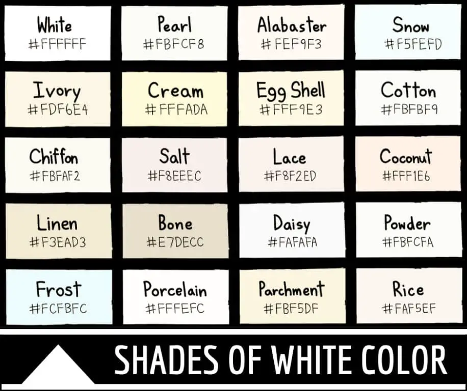
There are many subtle variations of white that give it more warmth, coolness, or brightness when used in design. Here are some of the most common white shades and their definitions:
Bright White – This is the brightest and purest white. It contains no traces of gray or other colors. Bright white has a blue leaning undertone.
Cool White – Slightly less bright than pure white, cool white has a higher amount of blue undertones which gives it a crisp, clean appearance.
Warm White – This white shade has a yellow or red leaning undertone which provides a softer, cozier feeling. It is commonly used to evoke comfort.
Cream – Cream is an off-white shade that contains a pale yellow tone. It provides a vintage, antique look.
Eggshell – Eggshell white has a very subtle hint of yellow, akin to the shade of an eggshell. It is smooth and elegant.
Vanilla – Vanilla white is a pale, delicate shade with a beige undertone. It conjures images of vanilla ice cream.
Ivory – Ivory white contains a tiny amount of yellow-gray which creates an aged, graceful look. It is softer than bright white.
Snow – This white shade has a muted, milky quality. It is evocative of freshly fallen snow.
Linen – Linen white has muted yellow-gray undertones that give it a natural, textured look, like linen fabric.
Ash – Ash white is the lightest tone of gray with only a hint of the gray undertone. It is smooth and matte.
Seashell – Seashell white is very pale and gentle with the faintest warm peach tone. It calls to mind seashells on the beach.
Color Codes for White
In digital design, white color shades are defined by specific hex codes, RGB values, and CMYK percentages. These numerical color codes allow exact shades of white to be reproduced accurately across different programs and devices.
Hex Codes
Hexadecimal color codes are six-digit codes that represent the red, green, and blue components that make up each color. Here are the hex codes for some common whites:
| Bright White | #FFFFFF |
| Cool White | #F2F2F2 |
| Warm White | #FAF9F6 |
| Cream | #FFFDD0 |
| Eggshell | #F0EAD6 |
| Vanilla | #F3E5AB |
| Ivory | #FFFFF0 |
| Snow | #FFFAFA |
| Linen | #FAF0E6 |
| Ash | #E6E6E6 |
| Seashell | #FFF5EE |
RGB Values
The RGB color model uses varying intensities of red, green, and blue light to create colors on screens. Here are the RGB values for some whites:
| Bright White | R: 255 G: 255 B: 255 |
| Cool White | R: 242 G: 242 B: 242 |
| Warm White | R: 250 G: 249 B: 246 |
| Cream | R: 255 G: 253 B: 208 |
| Eggshell | R: 240 G: 234 B: 214 |
| Vanilla | R: 243 G: 229 B: 171 |
| Ivory | R: 255 G: 255 B: 240 |
| Snow | R: 255 G: 250 B: 250 |
| Linen | R: 250 G: 240 B: 230 |
| Ash | R: 230 G: 230 B: 230 |
| Seashell | R: 255 G: 245 B: 238 |
CMYK Values
In CMYK color, which is used for print design, colors are mixed using percentages of cyan, magenta, yellow, and black ink. Here are CMYK values for some whites:
| Bright White | C: 0% M: 0% Y: 0% K: 0% |
| Cool White | C: 2% M: 1% Y: 3% K: 0% |
| Warm White | C: 1% M: 2% Y: 8% K: 0% |
| Cream | C: 0% M: 3% Y: 17% K: 0% |
| Eggshell | C: 6% M: 5% Y: 15% K: 0% |
| Vanilla | C: 2% M: 14% Y: 32% K: 0% |
| Ivory | C: 0% M: 0% Y: 4% K: 0% |
| Snow | C: 1% M: 3% Y: 3% K: 0% |
| Linen | C: 2% M: 7% Y: 10% K: 0% |
| Ash | C: 0% M: 0% Y: 0% K: 13% |
| Seashell | C: 0% M: 5% Y: 7% K: 0% |
Using White in Design
White is ubiquitous in design and art because of its versatility. Here are some key considerations when working with shades of white:
– Context – Choose white shades that complement other colors in a design. Cool whites pair well with blues and greens, while warm whites support yellows and reds.
– Lighting – Monitor the white under different lighting conditions. Some shades can read differently in warm vs. cool light.
– Balance – Too much white can feel stark and empty. Use off-whites to soften an all-white design.
– Contrast – Pair white with darker shades for sufficient contrast and legibility. Ivory provides lower contrast than bright white.
– Branding – Bright white feels clean, fresh, and modern. Ivory and cream evoke heritage and tradition.
– Printing – Adjust shades like cream and ivory on screen to account for how they will print.
– Psychology – White represents purity, simplicity, and space. But different shades also elicit subtle emotional responses.
– Accessibility – When using white for text, ensure it provides enough contrast from the background (4.5:1 ratio).
With its varied shades and moods, white is an essential part of any designer’s toolkit. Subtle variations of white can profoundly impact the look, feel, and meaning of a design. By mastering the use of white in its many incarnations, designers gain greater control over visual communication. Whether cool, warm, bright, or muted, white contains a spectrum of possibilities.
Conclusion
White is deceptively complex. While it may appear plain, white actually contains many subtle shades ranging from crisp, cold hues to earthy, warm tones. Each white variation has specific hex codes, RGB values, and CMYK percentages that define its precise color. When selected intentionally, the right white shade can increase legibility, establish mood, and reinforce branding. White helps create the blank canvas upon which other colors and designs can shine. This exploration of white’s calming yet inspiring depth shows why it remains an indispensable color for all visual media.
