Choosing colors that go well together is an important part of fashion and style. The right color combinations can create attractive, harmonious outfits that reflect your personal taste. Certain colors complement each other naturally, while others clash. Understanding basic color theory, having an eye for color contrasts, and knowing which hues flatter your complexion are key to looking stylish.
Complementary Colors
Complementary colors sit opposite each other on the color wheel. They create a striking contrast that grabs attention. Some examples of complementary color pairs are:
- Red and green
- Blue and orange
- Yellow and purple
Wearing complementary colors together produces vibrant, energetic outfits. It’s best to choose one color as dominant and use the other as an accent. For example, pair a red dress with green accessories or an orange top with blue jeans. Too much of both colors can be overpowering, so use the second color sparingly.
Analogous Colors
Analogous colors sit next to each other on the color wheel. They usually match well and create a cohesive, harmonious look. Examples of analogous colors include:
- Red, orange, and yellow
- Green, blue-green, and blue
- Purple, blue-purple, and blue
Outfits with analogous colors have a natural, effortless beauty. Feel free to use several shades of analogous hues together. For example, pair different blue dresses, tops, skirts, and accessories. Analogous colors blend seamlessly without clashing.
Triadic Colors
Triadic color schemes use three colors equally spaced around the color wheel. Some examples are:
- Red, yellow, blue
- Purple, orange, green
- Pink, yellow-green, blue-violet
Triadic colors have a vibrant, lively feel when combined. Balance is important, so use one color as a dominant hue and the other two as accents. For example, make blue your main color and add pops of red and yellow with accessories. Triadic schemes offer lots of flexibility for self-expression.
Split Complementary Colors
This scheme uses a base color, the color on either side of its complement, and a small amount of the complement itself. Some split complementary combinations are:
- Red, yellow-green, blue
- Purple, yellow-orange, green
- Pink, blue-green, orange
Split complementary color schemes have the same vibrant look as complementary colors but are more subtle. Use the complement sparingly to add interest without clashing. For example, wear a yellow-green dress with red heels and a blue bag.
Monochromatic Colors
Monochromatic color schemes use varying shades, tones, and tints of one base hue. Some examples include:
- Light pink, pink, dark pink
- Baby blue, sky blue, navy blue
- Mint green, green, forest green
Monochromatic is an easy, fail-safe approach to color coordinating. Different shades of the same color guarantees you won’t clash. Add interest by including various textures and patterns in the same hue. For example, pair a green shirt dress with green tweed pants and green satin heels.
Neutrals
Black, white, gray, tan, and other neutrals act as versatile basics that go with everything. Include neutrals when you want a subdued, minimalist look. For example:
- White top with black pants
- Gray blazer over a colorful dress
- Cream sweater with blue jeans
Neutrals also make an excellent background for accent colors. For example, vibrant red heels pop against a black dress. Just be sure to add other textures so your outfit doesn’t look washed out.
Metallic Colors
Metallic shoes, purses, jewelry, and other accessories add shimmer and glam to any outfit. Metallics to try include:
- Silver
- Gold
- Rose gold
- Bronze
- Copper
Metallic accessories work with everything from casual looks to formal wear. Limit yourself to one or two metallic pieces at a time so your outfit doesn’t look overdone. For example, pair a silver purse with nude heels or a rose gold bracelet with a black dress.
Prints and Patterns
Matching different prints and patterns in an outfit can be tricky. Avoid clashing by picking prints in the same color family or sticking to one print paired with solids. For example:
- Red polka dot top with red floral skirt
- Navy floral dress with paisley shawl
- Striped shirt with houndstooth pants
Make sure prints have similar scales (size of pattern) and contrast levels. Pairing small and large prints can look messy. Scale down large prints like plaid with solid basics in the same color scheme.
Choosing Colors for Your Skin Tone
The right colors can enhance your complexion while the wrong shades can make you look drained. Determine whether your skin is warm, cool, or neutral, then choose colors that flatter your undertone:
| Skin Tone | Flattering Colors |
|---|---|
| Warm – yellow, peach, golden undertones | Warm hues like red, orange, yellow, ivory |
| Cool – pink, rose, blue undertones | Cool hues like blue, green, magenta, gray |
| Neutral – balanced warm and cool tones | Both warm and cool colors suit nicely |
Skin tone also impacts how light or dark colors should be. Fair, light complexions look best in pastels while medium to dark skin stands out in richer, darker shades.
Finding Your Color Palette
Your personal coloring includes your skin tone, eye color, and natural hair color. Determine which hues enhance your individual features. For example, blondes shine in light colors while brunettes dazzle in deeper tones. Your ideal color palette will both flatter and express your style.
Analyze your closet and make note of colors you wear most. Pay attention to which shades get you the most compliments. Avoid unflattering hues that drain or overwhelm you. Gradually build a wardrobe around the most harmonious colors. Getting color right brings out your natural beauty.
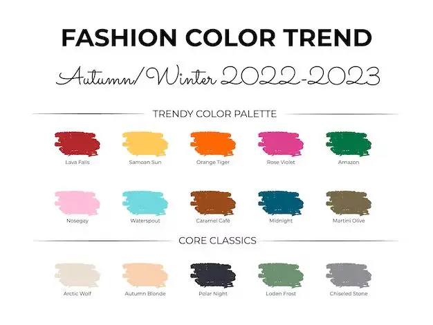
Fashion Color Trends
While choosing colors that suit your complexion is most important, it’s fun to incorporate trending shades as well. Fashion color trends help inspire new color pairings and combinations. Some current trending colors in women’s fashion include:
- Neon – vivid brights like hot pink, orange, lime green
- Pastel – soft powdery hues like lavender, butter yellow, seafoam
- Earth tones – rich neutrals like rust, olive, terracotta
- White – fresh, clean all-white looks
- Metallics – silver, gold, rose gold
- Tie dye – psychedelic rainbow effect
Follow #coloroftheyear hashtags to see up and coming color trends. 2023’s colors are viva magenta and lilac bark according to Pantone. Feel free to mix trendy colors with more classic shades that flatter you. Stepping outside your comfort zone keeps your style exciting.
Conclusion
Mastering color coordinating takes practice, but a few guidelines make it easier:
- Use the color wheel – complementary, triadic, analogous, and split complementary schemes naturally work
- Focus on 1-3 colors max for harmony
- Make one color dominant and others for accents
- Add metallics and patterns for interest
- Choose shades that flatter your complexion
- Include trendy colors that you like
Color is powerful. The right combinations not only look stylish but also express your personality. Don’t be afraid to make mistakes – have fun with color and find hues that make you shine. Soon you’ll develop an intuitive knack for mixing and matching beautiful, creative color palettes.
