A monochromatic color scheme refers to using different shades, tones, and tints within a single hue. This creates a cohesive, soothing, and elegant look. When decorating with a monochromatic color palette, it’s important to understand what colors complement the chosen hue to add visual interest through accent pieces. In this article, we’ll explore what colors go well with popular monochromatic color schemes like blue, green, purple, neutral, and red. We’ll also provide specific recommendations for accent colors that work with monochromatic palettes.
Benefits of a Monochromatic Color Scheme
There are many reasons to choose a monochromatic color scheme:
- Unity – Staying within one hue creates a strong sense of visual unity and harmony. The colors flow seamlessly from dark to light.
- Versatility – Monochromatic palettes work with any style from modern to traditional.
- Calming effect – Monochromatic colors have a soothing, peaceful quality with minimal color clash.
- Easy to match – It’s simple to find coordinating accent colors since everything is within the same color family.
- Focus on textures – With less color variation, monochromatic schemes let textures like wood, leather, metals shine.
While monochromatic palettes have many virtues, adding accent colors prevents the space from feeling flat or monotonous.
Choosing Accent Colors
When selecting accent colors to go with a monochromatic scheme, stick to these guidelines:
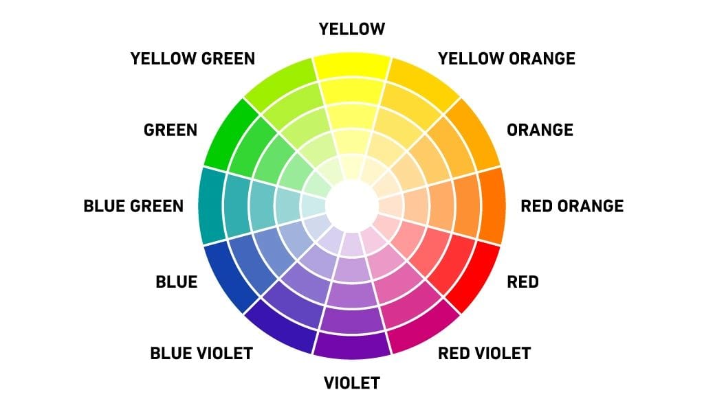
- Complementary colors – These are directly across from each other on the color wheel, creating a vivid contrast like blue and orange or red and green.
- Analogous colors – These sit next to each other on the color wheel, sharing a common hue. Examples include blue, blue-violet, and violet.
- Triadic colors – This uses colors equally spaced around the color wheel. Think orange, purple, and green.
- Neutral colors – Black, white, gray, beige are easy to incorporate into any monochromatic palette.
- Metallics – Gold, silver, bronze, and copper add shimmer while keeping a single-hue look.
Aim for accent colors in the 15-30% range so they provide a pop without overpowering the main palette. Next, we’ll explore accent colors that work with popular monochromatic color schemes.
Blue Monochromatic
From light powder blue to dark navy, a blue monochromatic scheme has universal appeal. Here are ideal accent colors:
- Orange – As blue’s complementary color, orange makes a vibrant contrast in accessories, artwork, flowers.
- Yellow – Blue’s adjacent color on the color wheel, yellow reads cheerful and optimistic against cool blues.
- Violet – Mixing blue’s warm and cool shades creates dynamic energy.
- Green – Aqua or mint green add a refreshing twist to monochrome blues.
- Metallics – Gold, silver, and mercury glass glimmer against blue’s serene palette.
Whether it’s nautical navy or airy powder blue, these accent colors keep the look interesting.
Green Monochromatic
From sage to emerald, green monochromes exude natural tranquility. Complement the palette with:
- Red – As green’s complement on the color wheel, red makes a dramatic counterpoint in flowers, throw pillows.
- Yellow – Drawing from adjacent yellow-greens and yellow-olives prevents a color clash.
- Blue – A touch of sky blue adds crispness to darker green backdrops.
- Violet – Deep purple plays up green’s lushness in upholstery or area rugs.
- Metallics – Antiqued silver and bronze emphasize green’s earthy ambiance.
Keep these options handy when designing a soothing, zen green monochromatic space.
Purple Monochromatic
Regal purple monochromes spanning lilac, violet, and wine have an air of refinement. Punch up the palette with:
- Yellow – Cheerful yellow breathes energy into somber purple backdrops.
- Green – Opt for grassy greens to prevent purple from feeling too
moody. - Orange – A vibrant pop of tangerine or peach prevents purple from feeling flat.
- Red – Crimson red makes a daring, passionate pairing with purple’s cool tones.
- Metallics – Gold and mercury glass amplify purple’s luxuriousness.
These lively accents keep purple palettes from feeling one-note.
Neutral Monochromatic
For an instantly chic look, a neutral monochromatic scheme spanning black, white, beige, gray has adaptable elegance. Integrate:
- Yellow – From buttery to gold, yellow infuses lightheartedness into neutral backdrops.
- Blue – Cerulean blue pops against white and beige while complementing gray.
- Green – Jade green makes a vibrant pairing with crisp white and brings interest to beige.
- Violet – Plum purple awakens a palette of white, black, and gray.
- Wood tones – Walnut, mahogany, oak add organic warmth.
With limitless possibilities, these accent colors give neutral interiors a stylish edge.
Red Monochromatic
From blush pink to oxblood, red monochromes make a dramatic style statement. Add intrigue with:
- Green – For bold contrast, incorporate emerald, mint, and apple green accents.
- Blue – Cyan blue has enough punch to hold its own against fiery reds.
- Yellow – A smattering of mustard yellow draws out red’s fiery quality.
- Black and white – Crisp black and white provide relief from red’s intensity.
- Metallics – Polished gold, gleaming silver, and copper bring sophistication.
Red craves lively accent colors to keep its passion from feeling one-dimensional.
Using Neutrals as Accents
Regardless of your base monochromatic hue, neutrals make foolproof additions.
- Black – This classic neutral provides definition against any backdrop.
- White – Crisp white makes colors pop and feels fresh in any space.
- Gray – Mixing white and black, gray creates versatile contrast.
- Beige – Earthy beige enhances neutrals and grounds bright accent colors.
Keep these neutrals on hand when designing any monochromatic color scheme.
Example Color Combinations
Here are some specific color combinations to inspire your monochromatic palette:
| Monochromatic Base | Accent Colors |
|---|---|
| Navy blue | Mustard yellow, bronze, white |
| Sage green | Plum, copper, creamy beige |
| Lavender purple | Sea green, silver, black |
| Soft gray | Coral pink, oak wood, jet black |
| Blush pink | Emerald green, gold, navy blue |
Feel free to mix and match accent colors within the same color family. The important thing is maintaining cohesion in the base monochromatic scheme.
Using Textiles and Paint for Accents
Beyond decor selections, textiles and wall paint make it easy to incorporate accent colors:
- Throw pillows – Use solids or patterns in accent colors for removable pops of color.
- Area rugs – Anchor seating areas with a rug reflecting accent colors.
- Drapes – Select sheer or colored curtains to frame windows and highlight accent hues.
- Blankets – Add visual interest layering beds and sofas with colorful woven throws.
- Painted accents – Use accent colors on one wall, the back of bookcases, ceilings or trim for an unexpected twist.
Paint and fabric accents show that color can be added through more than just furniture and accessories.
Conclusion
The right accent colors can take a monochromatic palette from boring to bold. Complementary, analogous, and triadic colors make lively complements to monochrome bases in blue, green, purple, neutral and red. Aim for accent colors in the 15-30% range for maximum impact. Beyond paint and decor, textiles like pillows, rugs, and throws add pops of color. With the guidelines provided, you can confidently choose accent colors to make your monochromatic scheme shine. Feel free to break traditional “rules” and get creative with unexpected color combinations that express your unique style!
