Pink is a popular and beloved color that can be found in nature in flowers like cherry blossoms and peonies. In fashion and design, pink is known as a feminine, soft, and romantic color. But pink has many shades and varieties, ranging from very pale to deep hot pink. So what other colors are similar to the color pink?
Colors Related to Pink
There are several colors that are closely related to and associated with pink:
Red
Red is the color from which pink is derived. By mixing red with white paint or ink, you make pink. So red is the closest primary color relation to pink. Pure red and vivid pink go well together in fashion, graphic design, and interior decorating.
Rose
Rose is a soft, pale reddish pink that is named after the rose flower. It is a popular paint color in bedrooms and bathrooms. Rose pink has the same soothing, romantic qualities as pink but is much softer and more delicate looking.
Magenta
Magenta is a color made by mixing red and purple paint or light. It leans more towards the purple side of pink with a berry or raspberry tone. Magenta is often described as hot pink and goes well with accessories, patterns, and graphic elements.
Fuchsia
Fuchsia is a vivid, purplish shade of pink, named after the fuchsia flower. It pops against white in floral arrangements and pops brightly against black in fashion. Fuchsia has the playfulness of pink but with more drama and boldness.
Salmon
Salmon is a soft peachy-pink that gets its name from the color of salmon flesh. It is an extremely versatile color that goes well with neutrals like white, beige, gray, and khaki. Salmon pink has the same warmth as pink but is more subtle.
Tones of Pink
Within the pink family, there is a wide spectrum of pink shades and tones:
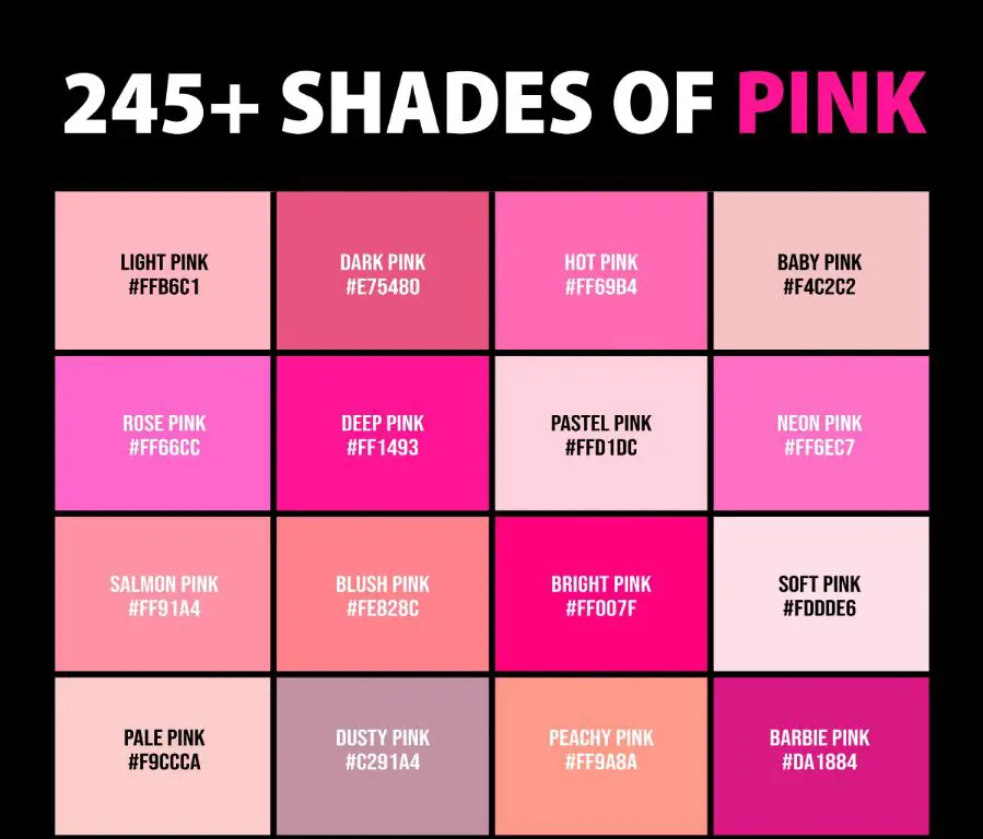
Pastel Pink
Pastel pink is an extremely pale, soft, and delicate tone of pink. It has a very low saturation and value and often looks powdery. Pastel pink evokes sweetness, innocence, and femininity.
Baby Pink
Baby pink is slightly bolder than pastel pink but still very soft, light, and gentle. It is associated with infants and young children. Baby pink is often used in nurseries, baby showers, and little girl’s dresses.
Ballet Pink
Ballet pink is a pale, cool-toned pink, lighter than baby pink. It is the traditional color used for ballet costumes and shoes. Ballet pink has an ethereal, angelic sensibility.
Candy Pink
Candy pink is a pale pink with warm, reddish undertones like colored candy or bubblegum. It looks sweet, playful, and cheerful. Candy pink is youthful and fun.
Dusty Pink
Dusty pink is a soft, neutral pink with a slightly grayish or muted tone. It is extremely versatile for fashion, home decor, and weddings. Dusty pink is subtle, calming, and relaxing.
Bright Pinks
Brighter, bolder pinks are eye-catching accent colors that add energy, fun, and vibrancy:
Watermelon Pink
Watermelon pink is a bright reddish-pink, like the interior flesh of a watermelon. It looks juicy, fresh, and summery. Watermelon pink pops at summer parties and events.
Raspberry Pink
Raspberry pink is a rich pink with cool blue undertones, like the raspberry fruit. It is a bold pink but more sophisticated than neon pink. Raspberry pink accessories stand out.
Frosted Pink
Frosted pink has a bright, cool blue undertone that makes it pop against warm neutrals. It is a playful pastel shade that looks like pink frosting. Frosted pink is great for birthdays.
Carnation Pink
Carnation pink is a bright tone inspired by carnations. It leans slightly purple and looks high-energy alongside red and white. Carnation pink is fun at events.
Hot Pink
Hot pink is the most vivid, neon-like shade of pink. It screams for attention. Hot pink makes dynamic graphic accents in fashion, ads, and product packaging.
Deep Pinks
Pink also comes in richer, deeper hues that add drama, intimacy, and sophistication:
Blush Pink
Blush pink is a soft, warm-toned pink that resembles a natural blush on cheeks. It looks romantic, dreamy, and elegant, especially with gold accents. Blush pink is trendy in weddings.
Bashful Pink
Bashful pink is a pale, sheer pink that almost seems to glow from within. It has an ethereal, otherworldly quality. Bashful pink creates a magical ambiance.
Rose Gold Pink
Rose gold pink is a rich, metallic pink with golden shimmer, like the metal rose gold. It looks opulent and luxurious, especially alongside real metals and neutrals.
French Pink
French pink is a deep tone halfway between pink and red. It looks sophisticated, Parisian, and feminine. French pink is an upscale neutral in fashion and decor.
Wine Pink
Wine pink is a dark shade of pink tinged with red-violet, evoking the hue of red wine. It looks refined, elegant, and grown-up. Wine pink adds drama and boldness.
Similar Color Palettes
Here are some color palettes that feature various pink shades and complementary colors that go well with pink:
| Palette Name | Colors |
|---|---|
| Pastel | Pastel pink, mint green, lavender, buttercream |
| Vintage | Dusty pink, sage green, brick red, tan |
| Bright | Hot pink, tangerine, lime green, turquoise |
| Garden | Salmon pink, moss green, butter yellow, sky blue |
| Tropical | Fuchsia, seafoam, chartreuse, orange |
| Sunset | Deep pink, coral, burnt orange, yellow |
| Romantic | Blush pink, mauve, rose gold, champagne |
| Neon | Hot pink, acid green, yellow, cyan |
| Muted | Dusty pink, olive green, beige, oatmeal |
Pink Color Psychology
Color psychology gives insight into how different pink shades impact moods, feelings, and meanings:
Positive Associations
– Soft, soothing, calming
– Sweet, cute, charming
– Playful, fun, youthful
– Romantic, loving, feminine
– Hopeful, optimistic, positive
Negative Associations
– Immature, childish, silly
– Weak, powerless, unprofessional
Using Pink in Design
Here are some tips for effectively using pink and pink accents in visual design:
– Use softer pinks like blush pink and rose pink for a romantic, feminine look.
– Opt for hot pink or fuchsia accents to create energetic, playful designs.
– Monochromatic pink palettes project a sweet, delicate aesthetic.
– Pair bright pink with deeper shades like maroon or navy for vibrancy.
– Add grey to dusty pinks to give a more subtle, sophisticated effect.
– Use pink alongside black for bold graphic impact in patterns.
– Choose pink with warm undertones like salmon pink for a fresh springtime vibe.
– Combine pink with gold, rose gold, or champagne metallics for an opulent style.
Conclusion
Pink has many nuanced shades ranging from the palest pastel to the boldest hot pink. Colors like red, rose, fuchsia, salmon, and magenta have a close kinship to pink. Within the pink family, tones like blush, bashful, neon, and wine pink all express different moods. Pink color psychology reveals its cheerful, romantic, and feminine attributes. In design, pink provides endless possibilities to craft soft, energetic, elegant, or whimsical aesthetics. Whatever shade of pink your project calls for, this color and its sister hues will bring visual delight, femininity, and positivity.
