Hue refers to the dominant wavelength or color that our eyes perceive when looking at light. It is one of the main properties of color, along with saturation and brightness. Understanding hue is key to mixing, selecting, and working with color effectively.
Definition of Hue
Hue specifically refers to the position of a color on the visible spectrum. The visible light spectrum includes all the colors the human eye can detect, ranging from red to violet. In technical terms, hue represents the dominant wavelength of light that reaches our eyes.
For example, an orange hue corresponds to light composed primarily of wavelengths around 600 nanometers. A blue hue corresponds to wavelengths around 480 nm. Each hue occupies a specific place along the continuum of the visible spectrum.
Hue also correlates approximately with dominant color names like red, orange, yellow, green, blue, purple. So when we say a color “has a blue hue,” we mean it appears similar to the color blue as our vision perceives it.
Hue vs. Chroma vs. Value
Hue differs from two other main attributes of color:
– Chroma, also called saturation, refers to the intensity or purity of a color. Saturation describes how vivid or dull a color appears.
– Value, also called lightness or brightness, describes how light or dark a color is.
For any particular color, the hue refers specifically to its position on the color spectrum. Saturation describes its vibrancy. Lightness describes how much white or black is mixed in.
For example, both sky blue and navy blue have a blue hue. But navy blue has a lower lightness and greater saturation. Pink and red have a similar hue, but pink has lower saturation.
Hue’s Role in Color Mixing
Understanding hue helps us predict what colors will result when we mix paints or light. Pigments and light combine in different ways, but hue remains fundamental.
With paints and dyes, the hue generally doesn’t change when mixing. Mixing blue and yellow paint produces a green paint – the hue shifts between the starting hues. Mixing a very saturated blue with white will produce a lighter blue with the same essential hue.
When combining colored light, the hue can shift in more complex ways. But red and green lights will still combine to give yellow light. The hue moves between the starting hues.
Knowing the hues of primaries (red, blue, yellow for pigments; red, blue, green for light) helps predict what hue the mixtures will take. Understanding hue leads to greater control of color mixing.
Using Hue in Color Selection
Hue is extremely important in determining the psychological feel of colors and their use in art and design.
Warm hues like red, orange and yellow are energetic and eye-catching. Cool hues like blue, purple are more soothing and receding. Green is considered peaceful and natural. These psychological associations help guide the use of hue in everything from logos to Interior decoration.
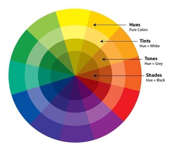
Adjacent hues on the color wheel, like orange and yellow, coordinate well together. Complementary hues opposite each other, like purple and yellow, create a striking contrast. Monochromatic color schemes use tints, tones and shades of a single hue. Hue underlies all these color relationships.
Understanding hue allows designers and artists to select colors precisely for the visual impact or mood they wish to achieve. It establishes harmony and contrast within a palette. Mastering hue creates intention and control in artistic work.
Measuring Hue Values
Several color order systems exist to precisely specify hue along with saturation and lightness. These include:
| Color System | Hue Measurement |
|---|---|
| HSV | Hue value from 0° to 360° |
| HSL | Hue value from 0° to 360° |
| Munsell | Hue value from 0 to 10 |
These systems allow hue to be communicated precisely. Most color pickers and editing tools allow hue to be adjusted numerically along with the other two dimensions.
Print designers may use swatch books like Pantone to select very specific hues. Digital tools provide great flexibility in specifying hue and saturation to create exact colors.
Hue Perception and Color Vision
Not all people perceive hue identically. About 1 in 12 men have some type of color vision deficiency that affects their hue perception. The most common form is difficulty distinguishing red and green.
This is caused by anomalies in the cone cells of the eye that detect different wavelengths of light. When some cones are missing or defective, it reduces hue discrimination.
Interestingly, some species like dogs are dichromats, meaning they have only two cone cell types. Their hue perception is limited to yellows, blues and shades of gray. Bees see ultraviolet light unseen by humans, expanding their hue range. The full spectrum we see define the hues available to us.
Our hue perception can also be altered by environmental conditions. Colored lighting, shadows and surrounding colors all impact the apparent hue of an object. Optical illusions can trick our eyes into seeing false hues. But generally hue perception is very consistent.
Using Hue in Art Media
Understanding hue is critical when working with traditional color media:
– **Painting** – Paints mix subtractively following their inherent hues. Primary paint hues are red, blue, and yellow.
– **Printmaking** – Inks are chosen and mixed based on hue to create vibrant images. Complementary hue contrasts add visual impact.
– **Photography** – Color temperature controls the warmth or coolness of hues. Filters adjust hue casts from lighting conditions.
– **Dyeing** – Fiber artists blend dye baths to shift fabric hue. Dye chemistry gives each dye a characteristic hue range.
– **Glasswork** – Glass ingredients impart specific hues, mixed in appropriate ratios to create desired colors
– **Ceramics** – Glazes and stains come in ranges of hues, layered and blended to color clay work.
Understanding these media along with color theory allows hues to be controlled and implemented creatively. Mastery of hue takes artistic work to a higher level.
Conclusion
In summary, hue refers to the dominant color we perceive when viewing light or an object. It specifies position on the visible spectrum. Hue differs from properties like saturation and lightness that describe color intensity and brightness.
Hue plays an essential role in color mixing, relationships, and perception. It enables deliberate control over the feel and impact of color in art and design. Precise hue measurement is possible using color order systems and tools. Hue forms a fundamental building block for effective and meaningful use of color.
