Choosing the right color palette to complement the bold and dynamic red can be tricky. Red is associated with energy, passion, and intensity. While a fantastic anchor color, pairing the wrong tones with red can make it overwhelming. When selecting a red color scheme, you’ll want hues that balance the excitement of red without dulling its impact.
Why is red an excellent base color?
Red is a primary color and arguably the strongest, most dynamic of the primary palette. Its associations with love, warmth, anger, and intensity make it a perfect accent color when you want to dial up energy. Red attracts the eye and sets an emotional tone.
Red remains a go-to staple in branding and design for this reason. A 2012 study showed participants felt their heart rate increase just by glancing at the color red briefly. Using red strategically evokes a physical response. For example, fast-food chains often employ red in their logos and branding. The color incites excitement and energy, driving appetite.
However, these stimulating effects require balance in a complete palette. Too much red will feel jarring. The right supporting shades allow red’s assets to shine without becoming overwhelming. Let’s look at excellent pairings that complete red successfully.
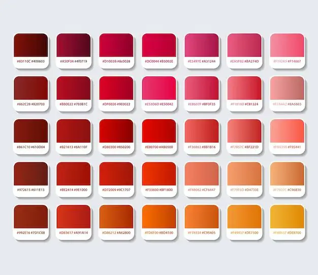
Monochromatic red palettes
One simple yet striking approach is selecting different shades of red for a monochromatic scheme. This style enables the color’s attributes to take center stage while adding needed depth. Here are some examples of monochromatic palettes using red tones:
Bright red + pink + burgundy
This lively combo mixes a clean, bright cherry red with soft pink and deeper burgundy accents. The brighter shade grabs attention, while the pink and burgundy add subtle sophistication and depth. Try combining a bright red jacket or lipstick with a blush pink blouse and darker wine accessories.
Red + orange-red + dark red
For a bold, fiery palette, choose hues leaning towards orange-red, true red, and deeper reds with brown tints. The orange undertones provide warmth and vibrancy to balance a rich chocolate-y red. This palette makes a striking statement. An orange-red dress or tie will pop against darker crimson backgrounds.
Red + pink + maroon
Alternatively, red enlivened with bubblegum pink and moody maroon creates an elegant, feminine scheme. The lighter pink softens red’s brute force, while maroon offers sophistication. Together they create a palette suitable for events like weddings, tea parties, or dates.
Red and green
Red and green is a festive Christmas staple for a reason – the colors are direct opposites and intensely accent each other. Paired strategically, the combination is dynamic without clashing. Keep hues brighter rather than muted.
Red + Kelly green + evergreen
Vibrant cherry red pops dramatically against kelly green, balanced by classic evergreen. Limit green accents to avoid overwhelming the eye. A kelly green belt or jewelry makes red outfits stand out.
Red + forest green + jade
For a more natural palette, pair red with earthy, mellow greens like forest, sage, and jade. With muted saturation, these shades complement without competing with red’s intensity. Use forest green jackets or sage accessories to enhance red outfits.
Red and blue
Spanning the color wheel from red, cool blue makes an unexpectedly versatile partner. Choose bolder shades rather than pastels for vibrancy.
Red + royal blue + navy
Punchy true red alongside rich royal and navy blue creates a clean, patriotic palette with high-contrast impact. Use as accents for powerful colorblocking in outfits or graphics.
Red + turquoise + cobalt
For a youthful, pop art spin, brighten blues toward turquoise and cobalt. Against cherry red, the hot and cold contrast is fun and quirky. Use as complements in graphics and marketing for high energy.
Red and purple
Rec and purple combine two intense extremes of the color wheel for dramatic effect. From romantic to moody, it’s ideal for creating ambiance and accentuating red’s boldness.
Red + pink-purple + plum
Vibrant red with soft lavender and plum purple produces a wildly romantic palette. The undertones of pink and blue create a dreamy effect, perfect for wedding colors or event decor.
Red + eggplant + lilac
Deeper, cooler purples like eggplant and lilac offer a sophisticated edge. Against true red, the palette becomes richer but retains tension. Use for formal affairs or elegant bouquets with red roses.
Red and neutral
Don’t overlook classics like red with black and gray. Sophisticated neutrals allow red to take the spotlight while enhancing its versatility.
Red + black + charcoal
A red, black and dark gray palette has timeless appeal. Against neutral backgrounds, red really pops while keeping outfits or designs grounded. Use for bold graphics, beautiful in simplicity.
Red + light gray + white
For softer neutral pairings, try lighter grays and white. Especially with pink-tinged reds, this helps maintain the lively hue. The clean contrast allows any red item to stand out elegantly.
In Review
When designing with dominant red accents or backgrounds, choose supporting colors carefully. The right partners will balance red’s boldness without dulling the impact.
Monochromatic red schemes in various shades are simple go-tos. For color duos, red pops against contrasting hues like green, blue, purple and basic neutrals. Keep pairings clean and vibrant rather than muted.
Avoid combos that clash rather than complement. Green, blue and purple work due to being direct complements on the wheel. Orange, yellow or brown lean too close to red’s wavelength. Instead, add analogous shades like pink, burgundy, magenta or salmon.
With strategic color pairing, red consistently delivers showstopping results. It provides endless options to liven any design with energy and passion.
Conclusion
Red is a fantastic accent color that grabs attention and conveys excitement. However, pairing the wrong tones with red can make it overwhelming. Stick to shades that balance red’s bold impact without dulling it. Monochromatic red palettes work beautifully. For color duos, complementary hues like green, blue, purple, and neutral black/gray allow red to pop gracefully. With strategic combinations, red consistently energizes any design or outfit with passion and vibrancy.
