A color scheme refers to the choice and use of colors in design. The colors used in a design or artwork play a major role in conveying mood, creating emphasis, and tying elements together. Carefully selecting a color palette is an important part of graphic design, interior design, fashion, and many other creative fields.
When creating a color scheme, designers carefully consider factors like color theory, color psychology, aesthetics, and practical concerns. An effective color scheme contributes to the unity and visual impact of a design while supporting its purpose. Read on to learn more about what a color scheme is, how color schemes are developed, and the different types of color schemes.
What is a Color Scheme?
A color scheme is the set of colors chosen and used in a design. The colors are chosen purposefully to interact in specific ways and evoke particular responses. Color schemes are a core part of visual aesthetics and are used in fields ranging from graphic design to interior design.
Color schemes encompass both the selection of colors and how they are used in a composition. This includes factors such as:
– The number of colors used in a design
– Which hues are used and their relationships on the color wheel
– The saturation, value and temperature of the colors
– How colors are distributed spatially and their proportional balance
– Colors used for backgrounds, text, accents, etc.
– Relationships between colors like harmony, contrast and gradation
By carefully controlling these factors, designers develop color schemes that are aesthetically pleasing while supporting the intentions behind a design. For example, an exciting, vibrant color scheme may be effective for a children’s book cover, while a professional business brochure may call for a conservative, complementary palette.
Principles for Creating Color Schemes
Several key principles and considerations guide designers when developing color schemes:
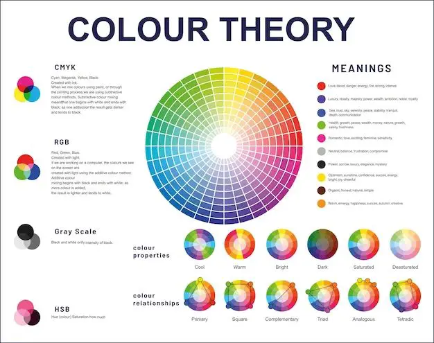
Color Theory – Color theory examines how colors interact visually and the symbolic meanings behind colors. It provides a framework for combining colors in meaningful ways. Critical color theory concepts include:
– The color wheel – Colors are arranged in a circle based on their hue and relationship. Opposite colors are complementary, adjacent colors create harmony.
– Color psychology – Colors evoke emotional and psychological responses. Warm colors feel energetic, cool colors feel calming.
– Color context – The meaning and impression of a color is influenced by its application. Red has a different effect on a stop sign than on a Valentine’s card.
Aesthetics – The color scheme should create a cohesive, pleasing visual experience. Factors like color harmony and spatial balance contribute to aesthetics.
Function – The colors used should reinforce the purpose of a design. A scheme for a child’s room may be playful, while a financial website needs to feel stable and professional.
Accessibility – Colors should be readable and distinguishable by people with visual impairments. Having sufficient contrast between text and background is vital.
Relevance – Colors associated with certain emotions, cultures, or contexts can add meaning to a design. Using nautical colors for a seafood restaurant helps reinforce its theme.
Flexibility – A color scheme should work across different mediums like print vs digital. It also needs to retain integrity when colors are lightened or darkened.
By balancing these factors strategically, designers derive color schemes that enhance designs both visually and functionally.
Types of Color Schemes
There are several common types of color schemes used across various disciplines. Each one involves specific color relationships and interactions.
Monochromatic – A monochromatic scheme uses variations in lightness and saturation within a single base hue. This creates a minimalist, elegant look.
Analogous – Analogous colors are adjacent on the color wheel, creating pleasant, harmonious combinations like blue, blue-green, and green.
Complementary – Complementary colors like red and green strongly contrast, creating vibrant visual effects. They are opposites on the color wheel.
Triadic – A triadic scheme uses three colors equally spaced around the color wheel, such as red, yellow and blue. The contrast creates visual interest.
Split-Complementary – This scheme uses a color and the two hues adjacent to its complement, such as blue with yellow-orange and red-orange.
Tetradic – Four colors spaced evenly around the color wheel make up a tetradic scheme, giving options for many color combinations.
Warm and Cool – Warm colors like red, yellow and orange contrast with cool colors like blue, green and purple. This contrast adds energy.
Neutral – Black, white, gray and brown create monochromic, neutral schemes commonly used in fashion and modern design.
These are just some of the many types of color schemes designers draw upon while developing a color palette. Many schemes use customized variations of these concepts.
How to Choose a Color Scheme
Choosing an effective, cohesive color scheme involves steps:
Define the mood and goals – What should the design communicate visually and emotionally? What impression or atmosphere do you want to create?
Research and brainstorm – Look at color psychology, meanings, and examples of palettes that create your desired effect. Start gathering ideas.
Limit your palette – Stick to 2-4 core colors for your central scheme. This keeps things simple and cohesive.
Use a color wheel – Pick a base color then select harmonious hues based on color wheel relationships like complementary or analogous schemes.
Consider contrast – Balance your colors in terms of temperature, saturation, and light vs dark. Contrast creates visual interest.
Choose accent colors – Accent with another 1-2 colors for emphasis. Hues drawn from your main colors work well for cohesion.
Examine versatility – Make sure your colors translate well to different mediums and backgrounds. Test light and dark versions.
Refine the scheme – Tweak hues, saturation, balance and accent colors iteratively until you achieve the desired effect.
Verify accessibility – Use an online color contrast checker to ensure adequate contrast between text and background colors.
Save color schemes created digitally into color palettes or style guides. This allows you to access specified colors easily for mockups, revisions and final designs.
Using Color Schemes in Design
Color schemes inform many visual design decisions:
Graphic design – Posters, logos, marketing materials, and website graphics rely on carefully chosen color palettes to establish cohesive visual styles.
Interior design – Interior color schemes create unified decor and ambiance. Coordinated colors are selected for walls, furnishings, accents and more.
Fashion – Fashion designers plan coordinated color schemes for clothing and accessories within each collection.
Architecture – Architects use exterior materials and colors to establish aesthetics and themes for buildings. Interior colors also support function.
Landscape design – Gardens, parks and other landscapes use coordinated vegetation, hardscaping and amenities that harmonize through color.
Branding – Logos, packaging and marketing for brands, products and services utilize color schemes to create recognition and convey positioning.
User interfaces – Onscreen elements like buttons, icons and menus are colored to aid usability and create visual identity.
Information design – Charts, diagrams and infographics use color strategically to encode data, establish hierarchy and attract attention.
Color schemes unify designs and engage viewers by harmonizing elements, adding contrast, and prompting emotional responses. Even simple logos and products rely on carefully defined palettes to support their goals and style.
Common Color Associations and Meanings
Certain colors carry widely recognized associations and symbolism that designers leverage to evoke targeted reactions:
Red – Passion, excitement, intensity, danger
Orange – Energy, happiness, creativity, autumn
Yellow – Joy, hope, intellect, summer
Green – Nature, health, stability, renewal
Blue – Calm, professional, sadness, winter
Purple – Luxury, spirituality, wisdom, royalty
Black – Power, sophistication, mystery, death
White – Purity, peace, cleanliness, innocence
Pink – Femininity, playfulness, warmth, love
Brown – Reliability, earthiness, durability, autumn
Of course, cultural context also influences meanings. But anticipating common color associations can give designers helpful starting points.
Color Theory Foundations
Several core principles of color theory help guide the creation of color schemes:
The color wheel – The color wheel arranges hues in a circle based on their relationships. Complementary colors are opposite, analogous colors are adjacent, and triadic colors are evenly spaced.
Hue – The pigment of a color otherwise referred to as its basic name like “red” or “green”. Changing hues creates contrast.
Saturation – The vividness and intensity of a color, from muted to highly saturated. Less saturated colors are subdued.
Value – How light or dark a color is. Lighter colors tend to recede visually. Value contrasts make elements stand out.
Temperature – Colors range from warm (red, orange, yellow) to cool (blue, green purple). Warm colors feel active while cool colors feel serene.
Context – A color’s perceived meaning and effect changes based on how and where it is used.
Understanding these core principles allows designers to intentionally craft color palettes that work together logically.
Psychology of Color
Color choices tap into psychology and emotions. Colors can evoke powerful, unconscious reactions in people. Marketing, design, and fine art all leverage color psychology:
Mood – Warm colors feel energizing and cool colors feel calming. Dark muted colors feel sophisticated and light vivd colors feel playful.
Emphasis – Vibrant contrasting colors attract attention while muted analogous colors recede.
Meaning – Colors like red and green have widely recognized associations like danger and nature.
Energy – Warm colors feel active and dominant. Cool colors feel restful and subtle.
Cheerfulness – Bright, saturated colors like yellow come across as happy and upbeat.
Calmness – Soft, cooler hues like blue and green suggest tranquility.
Strength – Darker, more saturated colors feel substantial, vivid light colors feel delicate.
Color associations in culture and nature create instant emotional responses. Designers think about psychology to craft deliberate reactions.
Color Considerations for Web Design
Selecting color schemes for digital interfaces like websites and mobile apps presents some unique factors to consider:
Screen display – Colors render differently on different monitors. Test palettes on multiple devices. Avoid relying only on extremely saturated hues.
Readability – Ensure enough contrast between text and background colors for easy reading. White space helps too.
Usability – Use color strategically to draw attention, differentiate categories, establish hierarchy, and aid navigation.
Responsive design – Check that colors and contrast remain effective when viewed on smartphones, tablets, and various screen sizes.
Personalization – Provide user options to select alternate color schemes to suit different preferences and abilities.
Cross-platform – Colors should display properly on different OS and browsers. Test across multiple environments.
Brand consistency – Coordinate colors with existing brand guidelines, including logo and marketing colors.
Digital interfaces give designers opportunities to use color in interactive, multidimensional ways. But they also introduce technical factors to evaluate. Testing color schemes is critical.
Accessibility and Color
When planning color schemes, accessibility for viewers with visual impairments or color blindness should be addressed:
– Ensure high color contrast between text and background for readability. Contrast ratio of 4.5:1 is recommended.
– Avoid conveying meaning only through color. Also use shapes, icons, spacing etc.
– Check colors and contrast on grayscale screens to detect issues.
– Provide options to switch between alternate color themes.
– Use tools like color contrast analyzers to identify and resolve problems.
– Test with online color blindness emulators to optimize palettes.
– Provide sufficient contrast even with colored fonts. Light colors on dark backgrounds can make reading difficult.
– Allow sufficient white space between elements to reduce visual clutter.
With testing and strategic color choices, designers can create schemes that effectively engage audiences of all abilities.
Examples of Color Schemes
Here are some examples of effective, cohesive color palettes used in various types of designs:
| Design | Colors Used | Type of Scheme |
|---|---|---|
| Children’s book cover | Bright green, blue, yellow, red, orange | Analogous and complementary |
| Abstract poster | Dark muted blues and grays | Monochromatic |
| Bakery logo | Pink, cream, brown | Warm triadic |
| Tech company website | Light blue, navy, white | Analogous |
| Modern interior paint | Steel gray, black, white | Neutral |
These demonstrate how different color schemes help communicate themes and create the desired ambiance.
Tools for Planning Color Schemes
Digital tools help design effective, accessible color schemes:
Color wheel apps – Experiment with color wheel relationships visually to generate palette ideas. Adobe Color CC provides advanced options.
Color palette generators – Enter a base color and tools like Coolors and Paletton suggest coordinated scheme options.
Color contrast checkers – WebAIM’s color contrast checker confirms if text and background combinations meet WCAG standards.
Color blindness emulators – Preview color schemes filtered to simulate different types of color vision deficiencies.
Online design platforms – Apps like Canva include templates and intuitive features for planning, saving, and applying color schemes.
Design software – Programs like Adobe Creative Suite offer robust color picking, saving, and editing capabilities for comprehensive control.
These tools help streamline color choices, provide guidance, identify issues early, and enable experimentation. This allows color schemes to be polished and finalized more efficiently.
Conclusion
A color scheme encompasses the careful selection, combination and use of colors in design. Factors like color theory, psychology, and aesthetics guide designers in crafting harmonious palettes tailored to project goals. Schemes convey mood, create emphasis, and unify elements within a composition. When thoughtfully executed, well-chosen color schemes have the power to engage viewers, evoke emotion, and bring designs to life. With an endless array of hues and infinite possibilities, color palettes can become a true artistic signature.