When choosing a shade of green for your dining room, there are several factors to consider. The shade you select can affect the mood, aesthetic, and functionality of the space. Choosing the right green will tie together your dining room decor and make the space feel cohesive. In this article, we’ll explore what shades of green work best in a dining room along with tips for selecting the perfect hue.
Consider the Purpose of the Space
The dining room is often considered one of the most formal rooms in a home. It’s a space meant for entertaining and enjoying meals with family and friends. The green you choose should complement the purpose of the room. Here are some common goals to keep in mind:
– Create an inviting atmosphere – Some shades like sage green exude warmth and welcome guests in. Stay away from cooler greens that may come off as standoffish.
– Promote conversation – Green hues like moss and olive stimulate interaction. Darker greens may make the space feel more intimate.
– Provide a relaxing setting – Soft, natural greens like mint and pistachio have a calming effect that’s perfect for leisurely dinners.
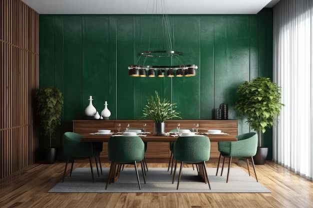
– Establish an elegant space – Deep emerald greens or blue-tinged shades like jade can give your dining room a refined, sophisticated look.
– Accentuate architectural details – Lighter yellow-greens like chartreuse nicely highlight decorative trim, moldings, and paneling.
Consider the mood you want to achieve in your dining space, then select a green shade that aligns with your goals. This will result in a cohesive look and feel.
Factor in the Amount of Natural Light
The quantity and quality of natural light your dining room receives should guide your green choice. Some shades get washed out in rooms with ample sunlight, while others feel too dark and dreary in low-light. Assess the lighting, then pick a green in a lighter or darker value accordingly.
Here are some examples:
– Sunny rooms – Go for crisp, vivid greens like emerald, kelly, or lime. Their high saturation prevents them from appearing faded.
– Northern light – Deep greens like hunter and forest green won’t get lost. Olive and sage also work well.
– Bright southern exposure – Pastel greens such as seafoam, pistachio, and mint hold their own in bright light. Avoid darker, moodier shades.
– Minimal natural light – Lighter greens can look dull. Choose jewel-tone greens like malachite or jade to inject color.
Take note of any glare or shadows as well. Matte or eggshell paint finishes diffuse harsh light. Glossy surfaces intensify it.
Coordinate With Your Existing Decor
You don’t want a random green that clashes with everything else. The shade you pick should integrate seamlessly into your current dining room decor. Here are tips for blending green with other colors:
– Warm neutrals – Moss, olive, and sage beautifully complement beiges, tans, and warm wood tones.
– Cool neutrals – Green is very versatile with grays, from soft seafoam to dramatic emerald. Avoid green with strong purple undertones.
– Reds and pinks – Shade of green look fabulous paired with tomato reds, raspberry pinks, and terra cotta. Try deep reds with emerald or lime with salmon pink.
– Blues and purples – Teal greens match light blues. Dark hunter pairs nicely with eggplant. With purple, stick to blue-based rather than yellow-based greens.
– Yellows and oranges – Citrus greens like chartreuse, lime, and kelly complement golden yellows and peach tones. Skip olive or emerald greens next to strong oranges.
– Metallics and patterns – Dark rich greens work best with metallic accents and bold geometric or floral prints. Use crisp brights or soft muted greens with subtle patterns.
Take a look around at your existing furniture, wall colors, artwork, and decor details. Use those as a guide for picking a compatible green. This ensures your shade ties into the overall design scheme rather than fighting against it.
Consider the Architectural Style of Your Dining Room
The era and style of your dining room should factor into your green selection as well. Some shades evoke certain design eras more than others. Be sure to choose a green fitting for the architecture and features of your space.
Here are examples of greens suiting various dining room styles:
– Farmhouse – Sage, moss, olive, create a rustic down-home look. Avoid bright jewel tones.
– Traditional – Hunter and forest greens complement elegant trims and crown moldings. Skip neon or pastel greens.
– Modern – Clean kelly greens, chartreuse, or lime reinforce sleek, contemporary spaces. Pass on antiqued or muted greens.
– Cottage – Soft seafoam green plays up the casually charming vibe. Dark forest green would feel out of place.
– Victorian – Deep emerald and jade create a refined, ornate aesthetic. Lighter greens might clash with the bold details.
– Industrial – Dark olive with gray or limewash undertones fits with exposed ductwork and metals. Avoid soft or bright greens.
No matter your dining room’s architectural style, there’s a shade of green that will enhance the look rather than appearing out of place. Selecting a hue harmonious with your room’s features creates a unified design.
Pick a Flattering Color Undertone
Greens range from cool blue-based undertones to warm yellow-based ones. The undertone significantly impacts how a shade looks. Be sure to pick one flattering for your dining room’s existing color palette and decor.
Here are the most common green undertones and their characteristics:
| Undertone | Characteristics |
|---|---|
| Warm yellow-based greens | Earthy, grounded Goes with reds, pinks, yellows Examples: Moss, sage, olive |
| Cool blue-based greens | Crisp, vivid Goes with blues, purples, grays Examples: Kelly, emerald, teal |
| Neutral greens | Balanced, versatile Goes with most colors Examples: Jade, mint, seafoam |
Blue-based greens have a bolder, more energetic look. Yellow-based are more relaxed and soothing. If your dining room has warm wood tones, ochre walls, and terracotta accents, stick with an earthy, yellow-undertone green. Cool blues and grays call for a blue-based green. For a versatile neutral, choose an even-keeled shade like sage or jade.
Pay attention to undertones. The wrong one can make a color feel disjointed and out of sync with the rest of the space.
Consider Dark vs. Light Shades
The depth and saturation of green varies widely. Dark, rich greens convey drama while light, muted greens have an airy, peaceful feel. Here are some tips on using depth of shade effectively:
– Small, windowless dining rooms – Light greens prevent the space from feeling claustrophobic. Try soft celery, seafoam, or mist.
– Large, open dining rooms – Saturated jewel tones like emerald and malachite won’t get lost. Olive and hunter green are bold options too.
– Formal dining rooms – Deep greens in gloss or semi-gloss finishes add elegance. Pair with brass or gold accents.
– Casual dining rooms – Lighter mints, sage, moss, and chartreuse keep the vibe relaxed. Use matte or eggshell paint finishes.
– Dining rooms with brown wood furniture or paneling – Lighter greens offset and enhance the wood while darker shades might compete with it.
– Dining rooms with patterned wallpaper or textiles – Vivid brights hold their own against busy backgrounds. Avoid using soft, pale greens which may get drowned out by other elements.
Dark greens can feel imposing in small dining spaces. Large or formal rooms need deep greens with presence. Assess the size, existing elements, and your goals for the dining room when deciding between dark and light green shades.
Look at Green Variations by Finish
Greens offer tons of variety depending on their finish – some are matte, some have shimmer or metallic flecks, others have weathered, antiqued finishes. Finish dramatically impacts the mood and style a green conveys. Here are some finish options to consider:
| Finish | Description |
|---|---|
| Matte | Flat, no shine Relaxed, casual look |
| Eggshell | Soft, subtle sheen Traditional, welcoming feel |
| Satin | Light reflective sheen Sleek, elegant appearance |
| Semi-Gloss | Medium-high shine Polished, upscale look |
| Gloss | High shine Bold, dramatic effect |
| Metallic | Embedded glitter flecks Luxe, glamorous look |
| Antiqued | Distressed, weathered Vintage farmhouse vibe |
A gloss or semi-gloss emerald dining room oozes sophistication. Matte sage has a casual, organic feel. Metallic green injects glittery glam. Sheen and texture provide stylistic variation. Consider the finish that best suits your aesthetic vision for the dining space.
Look at Real Green Paint Swatches
While it’s helpful to read about shades and finishes, nothing compares to looking at actual paint swatches. Colors appear differently on screen or paper than on an actual wall. With swatches, you can see how light impacts the hue and get a sense of the true tone. Evaluate swatches at different times of day as light shifts color perception.
Look at swatches painted on foam board or cardstock rather than just on paper. The white background approximates a dining room wall better than thin paper which can warp the tone. Paint overlapping swatches to compare side-by-side. View them in both natural and artificial light. Notice how the shade shifts.
Once you’ve narrowed down the selection, paint test swatches directly on your dining room wall. Live with them for a few days, ideally morning, noon and night, to make sure you’ve found the perfect green. There’s no better way than seeing it in the actual space.
Conclusion
With so many gorgeous greens to pick from, it can be tough deciding on a shade for your dining space. By factoring in the room’s purpose, architecture, lighting, existing decor, and the impact of undertones and finishes, you can identify the ideal hue. Choosing the right green will tie your dining room together, create the desired ambiance, and make a stunning impression on all who enter. Trust your intuition and select the shade that makes your heart sing. Then stand back and admire your beautifully inviting green dining room.
