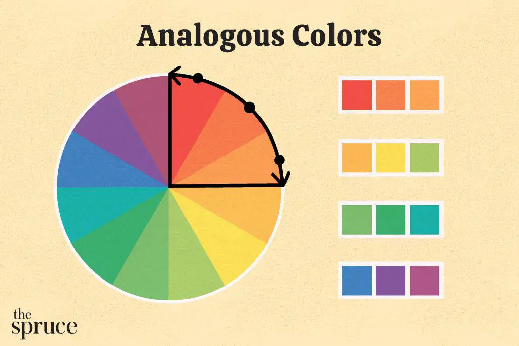
Analogous colors are groups of colors that are next to each other on the color wheel. They create a visually pleasing combination that provides harmony and continuity in design. Analogous color schemes are widely used in many fields including art, graphic design, interior decorating, fashion, and more. But where exactly are we most likely to come across analogous colors being utilized effectively? Let’s explore some of the most common applications of analogous colors.
Art
Analogous colors feature prominently in works of art, especially paintings. The analogous colors create a sense of visual continuity when used together in an artwork. Painters carefully select hues that are adjacent on the color wheel to create color harmony in their compositions. Claude Monet, one of the founders of French Impressionist painting, was a master of utilizing analogous colors in his artwork. His paintings like ‘Haystacks’ and ‘Water Lilies’ series make excellent use of analogous hues like shades of blue, green and yellow to depict light and atmosphere. Other iconic artists who employed analogous color schemes extensively include Vincent Van Gogh, Paul Cézanne, Georges Seurat and more. When used skillfully, analogous colors add richness and dynamism to artistic creations.
Graphic Design
Graphic designers greatly rely on analogous colors to create visually appealing designs. The seamless blend of adjacent colors on the color wheel helps graphic designers develop polished, professional looking designs. Some of the advantages of using analogous colors in graphic design:
| Promote visual continuity |
| Create color harmony |
| Add depth through subtle gradations in shade |
| Allow enough contrast to make elements stand out |
Layouts, logos, advertisements, marketing collaterals, infographics and more benefit from intelligently using analogous hues. Graphic design for digital interfaces also utilize analogous schemes effectively.
Interior Design
Interior designers and home decorators leverage the power of analogous colors to create inviting, coherent spaces. Analogous schemes help strike the right balance between visual excitement and a soothing flow in interior décor. Using analogous hues in furnishings, walls, floorings and other elements of interior design results in pulled-together, harmonious spaces. Varying shades of blue, green or red are commonly seen in interiors making use of analogous colors. Analogy allows interior designers to add nuance and layers to spaces without creating a chaotic or distracting appearance. The calming effect of analogous colors also promotes feelings of comfort and tranquility in living spaces.
Fashion
The fashion world has significantly benefited from incorporating analogous colors into clothing and accessory design. Analogous colors effortlessly unite various garments and pieces of an outfit into a stylish whole. Using shades of analogous colors such as blue, purple and pink together can inject visual flair into fashion. Analogy creates rhythm in an ensemble through gradual color transitions. In addition to clothes, analogous colors inform the designs of bags, shoes, jewelry and other accessories. Seasonal color palettes released by fashion companies like Pantone extensively feature analogous hues. Fashion brands leverage colors that sit side by side on the wheel to reflect current tastes and trends. The result is beautifully coordinated, on-trend fashion.
Cosmetics
The cosmetics industry relies heavily on analogous colors to create makeup palettes and products that appeal to consumers. Eyeshadow palettes, lipsticks, nail polishes and other makeup items extensively feature groups of analogous hues. Makeup products use analogous colors to enable users to effortlessly blend and coordinate shades. For instance, smokey eye palettes contain shades of gray, charcoal and black for seamless gradation. Similarly, lip and cheek tints utilize adjacent pinks, reds and corals. Analogous colors help cosmetic brands develop products that facilitate color harmony in makeup looks. This strategy stimulates sales by effectively addressing user needs.
User Interfaces
Interfaces of apps, websites and software leverage analogous schemes to create appealing, easy-to-use products. Interface designers carefully select analogous hues so that key elements stand out while retaining harmony. Adjacent shades applied to backgrounds, buttons, menus and other UI components results in cohesive interfaces that avoid visual chaos. The subtle color transitions guide users seamlessly across the interface during navigation. Vibrant analogous schemes can also reflect a brand’s identity through the user interface. Overall, analogous colors help technology companies build intuitive digital products that delight users.
Food Presentation
Culinary professionals recommend using analogous color strategies for food presentation to stimulate appetite appeal. Chefs carefully select and artfully arrange foods with analogous hues to create mouthwatering dishes. For instance, orange, peach and yellow foodscan make for an appetizing analogous color plate. Salads and appetizers also benefit from leveraging color analogy through ingredients with neighboring hues on the wheel. Vivid analogous combinations attract the eye and make dishes activation delicious. This strategy is commonly seen in commercial food photography as well where art directors employ analogous colors to elevate visual food aesthetics.
Signage and Wayfinding
Public signage and wayfinding design often utilizes analogous colors to effectively guide people. Airport signage, road and traffic signs, navigation apps and more leverage analogous schemes to clearly communicate information while looking aesthetically pleasing. For example, shades of blue and green are commonly paired in wayfinding design for intuitive directionality. Hospitals also rely on analogous colors to help people navigate through different departments and waiting areas. The harmonious blends of analogous hues make long term use of signage comfortable for the eyes. Overall, they balance conveying information with aesthetic sensibilities for functional, human-centered communication design.
Branding and Marketing
Smart use of analogous colors allows brands to build instant visual recognition. Leveraging shades from one portion of the color wheel creates a unified brand identity. Brands like Instagram (pink, purple), UPS (brown, gold), and Windows (blue, green) have effectively defined their identities with analogous palettes. Marketing collateral like logos, advertisements, product packaging use analogous schemes to reinforce branding. Analogous colors also enable brands to branch into complementary products by expanding the palette. Marketers take advantage of the subtle variation within analogous groups to target specific demographics. Overall, analogous colors help create impactful, cohesive branding across touchpoints to attract consumers.
Filmmaking
Directors utilize analogous color schemes during production design to create visual continuity in films. Through set pieces, costume design and lighting – movies heavily feature analogous colors to maintain cinematic harmony. For example, sci-fi films like The Matrix leverage different shades of green to build its dystopian setting. Period dramas rely on muted analogous colors that evoke the historical era portrayed. Movie posters and merchandise also apply the film’s analogous palette to recall its visual texture. This immersive world-building through sustained analogous schemes helps audiences suspend disbelief. It also becomes a powerful visual shorthand for franchises to trigger recall and nostalgia across sequels or prequels.
Landscaping
Gardening and landscaping extensively use complementary colors from nature to design vibrant, inviting outdoor spaces. Plants, flowers, pots, garden ornaments in analogous hues are combined to create an aesthetically seamless landscape. For instance, pastel flowers in shades of pink, lavender and white make for a gorgeous analogous garden scheme. Green lawns, trees with fall foliage and wooden benches can form an analogous nature palette. Analogous colors from nature evoke feelings of harmony and tranquility in outdoor spaces. They also help balance colors across a landscape for a composed look. Overall, landscapers leverage analogous colors to developspaces that integrate beautifully with natural environs.
Textiles
The textile and carpet industry utilizes analogous colors extensively in manufacturing processes. Cloth dyeing and printing relies on analogous dyes to create attractive fabrics. Designers also select neighboring thread colors for weaving and embroidery to make patterns pop. Carpet design patterns apply shades of similar hues for homely warmth. Analogy allows maintaining visual interest while avoiding the “busyness” of high contrast schemes. It enables producing yards of fabrics and carpets that retain color consistency. Textile manufacturers also use analogous colors to stay on trend based on seasonal color forecasts. This wide application makes analogous colors ubiquitous across clothing and upholstery.
Packaging Design
Packaging design for products uses analogous colors to make brand identities cohesive. Shampoo bottles, candy wrappers, toy boxes and other packaging feature analogous hues from brand palettes. Besides consistency, this helps products stand out on crowded shelves. For limited product drops and variants, the analogous colors expand to create a complementary range. Packaging colors also evoke product benefits through color psychology. Cool blues may denote refreshment while warm reds signify richness. Holiday packaging may use analogous schemes associated with the season like reds, greens and golds. Used creatively, analogous colors make product packaging eye-catching and refined.
Education
Schools, colleges and educational material makers incorporate analogous colors to boost engagement and learning. Classroom décor, furniture, stationery, books and supplies leverage analogous palettes that aid concentration and cognition. Cool blues and greens are associated with improved academic performance. Presentation slides, charts, diagrams and infographics also rely on analogous schemes to clearly communicate concepts. EdTech products and eLearning platforms apply interface design principles using analogy to reduce digital eye strain. On a psychological level, analogous colors provide comfortable, stimulating contexts for acquiring new skills and knowledge. Educational gaming apps also increasingly integrate analogous colors to make learning immersive.
Publication Design
Publishers and graphic designers select analogous color palettes to make the book and magazine reading experience seamless. Book covers, jackets, illustrations and layouts feature analogous schemes that enable visual flow. Text-heavy publications rely on narrow-ranged analogous hues for easy reading. The New York Times magazine is renowned for sophisticated layouts using the same season’s analogous palette across visuals and texts. Designed effectively, publications can also reflect the theme’s mood through strategic use of color analogy. Over the years, artful use of analogous colors has come to signify prestige and literary legitimacy in the world of publishing.
Nature
In the natural world, analogous colorsfrequently occur together to create visual splendor. Analogous colors dominate nature’s landscapes – from lush meadows to deep oceans. Fields of wildflowers display flows of analogous pinks, reds and oranges. Coral reefs contain analogous gradients of vibrant red, orange and yellow corals. Leaves transition through greens from lime to emerald to olive. Dapples of analogous purple, blue and mauve flowers cover mountains. Mimicry and camouflage in insects, reptiles and mammals employ analogous colors from the environment. Nature applies the principles of analogous colors extensively in the living world. Observing these color harmonies continue to inspire human aesthetics across domains.
Sports
Sports teams and affiliations strategically use analogous colors to strengthen their brand identity. Team jerseys, accessories, equipment, and facilities employ shades of one or two principal hues. Analogous colors on uniforms help fans instantly recognize and cheer for their favorite team. Sportswear and merchandise also apply analogous colors for stronger association. Stadiums and sponsored events rely heavily on leveraging their team’s analogous palette through signage, décor and marketing. The Olympics features analogous duos of blue, yellow and green across infrastructure to maintain branding. Sports channels cohesively adopt analogous Broadcast packaging as well. Overall, analogous colors allows sports brands to cement visibility and loyalty through consistent visual language.
Politics
Traditionally, national political parties have utilized analogous colors to mark their political identity. Conservatives favor blue hues while left-leaning parties prefer red. The Republican party heavily incorporates shades of blue. The Democrat party intensely uses analogous reds, even coining the term ‘Red states’. Candidates leverage analogous colors through their packaging, merchandise, and campaigning. Billboards, podium banners, flags and other collateral reinforce party colors through analogy. News channels use analogous colors from election coverage graphics to delegate political sides. Analogy in political colors allows rapid mass alignment along party lines during polls through strong visual cues. Political analogous colors deeply shape both national-level, grassroot public discourse and participation.
Vehicles
Analogous colors are integral to vehicle manufacturing and branding. Car exteriors, upholstery, dashboards often employ seamless analogous combinations. Combining shades of silver, gray and black on vehicles is a popular analogous choice. Showroom floors also strategically group vehicles in analogous colors for visual appeal. Some bestselling car models have signature analogous colors associated with them. Vehicle brands rely extensively on analogous palettes in logo design and marketing as well. Buses, airplanes and hot air balloons are also painted in analogous hues for aesthetics and visibility. The transportation industry creatively co-opts principles of analogous colors into functional vehicle design.
Conclusion
The applications of analogous colors span a vast range of domains, underlining their immense visual value. Music album covers, event décor, ceramics, quilting, photography, toys, and many more disciplines recognize the importance of leveraging analogous schemes. Their innate harmony and continuity enable smooth visual transitions. At the same time, slight controlled differences add sophistication. Balancing vibrancy with order gives analogous colors unmatched versatility. Tailored well to context, analogous colors can infuse excitement or calm into any space or object. Looking forward, advancements in AR and VR also indicate lucrative possibilities for employing analogous colors in immersive environments. The nuanced aesthetics and psychology of analogous colors will continue inspiring innovations across fields.
