Having an accurate color chart is essential for anyone working in design, photography, videography, printing, manufacturing, fashion, and more. A color chart allows you to communicate color precisely, match colors across different mediums, and maintain color consistency in your work. But what exactly is a color chart and why is it so important to have one? Here we’ll explore what color charts are, why you need one, and how to choose the right chart for your needs.
What is a Color Chart?
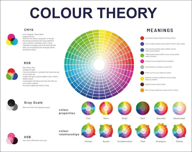
A color chart or color reference card is a physical chart showing different color swatches or patches with precise reference numbers attached to each color. The most popular and well-known color chart is the Pantone Matching System, which contains thousands of different solid colored swatches ranging from bright neon colors to muted earth tones.
Other common color charts include RAL, Munsell, NCS, and CMYK process color swatch books. Color charts assign numeric values or codes to each distinct color for easy and accurate identification. This allows designers, photographers, printers, and manufacturers to specify, communicate, and reproduce exact colors across different mediums.
Why You Need a Color Chart
There are several key reasons why using a standard color reference chart is essential:
Accurate color communication – Color charts provide precise numeric codes for each hue, allowing you to convey specific colors verbally or in writing. For example, saying “Pantone 17-5104 TCX” identifies a specific color.
Consistent color matching – Physical color swatches allow you to match colors visually and ensure color accuracy across different materials and finishes. You can match Pantone colors between coated and uncoated paper stocks.
Avoid guesswork and mismatches – Referring to numeric color codes eliminates ambiguity and guesswork. This prevents costly color mismatches and reproduction errors.
Standardized system – Major color systems like Pantone are globally recognized standards that provide a common point of reference across language and cultural barriers.
Reproduce lighting conditions – Some charts are designed to be viewed under specific lighting conditions to ensure accurate color assessment. Pantone swatch books indicate the ideal viewing light temperature.
Track color trends – Color charts and libraries are updated seasonally to include new popular hues. Designers can use charts to stay current on color trends.
Maintain brand color consistency – Using an official color chart allows brands to maintain precise visual identity and color consistency across all materials from print to packaging to digital.
Color quality control – Standard color references provide objective guidance for color approval and quality control during production.
Buy and specify materials – Knowing specific color codes allows you to purchase raw materials such as inks, dyes, paints, and textiles.
Choosing the Right Color Chart
With many different color chart systems available, how do you determine which one is right for your needs? Here are the key factors to consider:
Your industry or medium – Select a chart designed for your area of work. Pantone is great for print design. RAL or NCS work for paints and coatings.
Required color range – Larger libraries like Pantone contain thousands of hues. Smaller charts may be limited but less expensive.
Desired finish – Choose coated swatches for glossy printing or uncoated for matte finish. Metallic and neon colors are also available.
Viewing conditions – Some charts are optimized for viewing under daylight, office light, or specific light temperatures.
Budget – Larger complete libraries can get pricey. Minis and starter sets offer more affordable options.
Format – Consider loose leaf, bound books, box sets, or chip/card formats based on your usage.
Digital integration – Some charts integrate with design software for digital color picking. Look for available software plugins.
Industry adoption – Select a chart that your clients, manufacturers, and partners also use to enable collaboration. Pantone is the most widely used.
Getting the right color chart for your specific needs and workflow ensures you can communicate color effectively and achieve color accuracy in your projects and designs.
Popular Color Chart Systems
Let’s take a closer look at some of the major color chart systems available:
Pantone Matching System
The Pantone Matching System is the most widely used and well-known branded color chart standard. First created in 1963, the Pantone system includes over 10,000 colors designed for graphic arts and print design. Pantone swatch books and chips are universally recognized in the design industry.
Key features:
– Very large library of solid coated and uncoated colors
– Mini swatch books available for affordable options
– Available in loose leaf, chipbook, and bound formats
– Integrates with design software like Adobe Creative Suite
– Coated and uncoated versions to match printing finishes
– Organized into intuitive color families for easy browsing
RAL Color Standard
The RAL system originated in Germany and is widely used for paints and coatings. The RAL Classic chart contains 213 basic colors. RAL also has metallics, pearlescents, fluorescents, and custom colors. It is popular for industrial applications.
Key features:
– Optimized for paints, coatings, and plastics
– 213 basic colors, plus special effect colors
– Loose leaf swatch books or fan decks
– Matte, glossy, metallic, fluorescent options
– Primarily used in Europe
Munsell Color System
Munsell is a color space that scientifically quantifies colors based on hue, chroma, and value. It is popular in fields like botany, geology, and anthropology. The Book of Color contains over 1,500 color swatches.
Key features:
– Colors organized by hue, value, and chroma
– Widely used in science and research fields
– Book of Color contains 1,500 matte finish swatches
– Loose leaf and spiral bound books
– Designed for maximum color accuracy
NCS Color System
The Natural Color System is commonly used in Scandinavia and Europe. The NCS Atlas contains 1950 precisely quantified colors. NCS is organized by hue, blackness, and chromaticness.
Key features:
– Primarily used in architecture and design in Europe
– 1950 colors in the NCS Atlas
– Chips available in glossy, matte, and fluorescent
– Based on how humans perceive color
– Numeric and letter color notation
CMYK Process Colors
While not a standalone chart system, CMYK process color swatch books are essential for print designers. They show variations of cyan, magenta, yellow, and black ink mixes. Useful for checking color separations and press accuracy.
Key features:
– Displays colors created by CMYK printing process
– Vital for commercial offset lithography printing
– Show ink mixing and overprinting effects
– Available as swatch books or loose leaf pages
– Often integrated into Pantone Matching System guides
Tips for Using a Color Chart
Here are some top tips for making the most of your color chart:
– Refer to the chart’s indexing system to quickly identify colors needed.
– Always view the chart under the recommended lighting conditions. Daylight is ideal.
– Allow time for your eyes to adapt when matching colors visually from the chart.
– Use the right chart for your substrate. Coated swatches are for glossy surfaces, uncoated for matte papers.
– Replace older charts once a year due to fading from light exposure.
– For metallics and neons, select a chart with those specialty colors included.
– Fan out loose leaf charts periodically to prevent pressure fading of swatches.
– Purchase larger complete libraries to have access to the most color options.
– Supplement physical charts with digital color tools integrated into your software.
Conclusion
Using an industry-standard color matching system is a critical tool for achieving consistent, accurate color communication. Physical color charts eliminate ambiguity, provide objective reference points, and facilitate collaboration across teams and suppliers. Leading systems like Pantone are globally recognized across design and manufacturing fields. Investing in the right chart for your workflow and needs pays dividends through improved productivity and reduced errors. So tap into the power of color charts to take the guesswork out of color selection, identification, specification, and management.